|
|
|
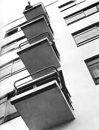
Michael Wolf
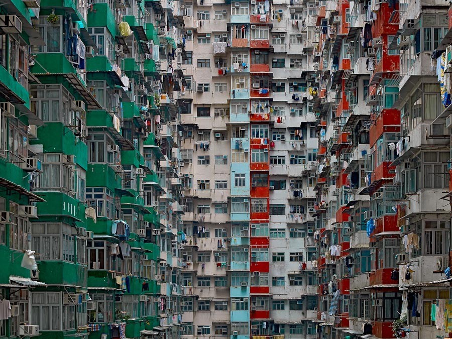 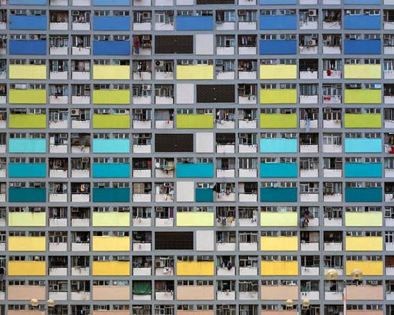 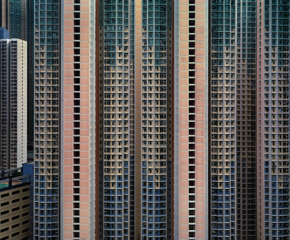   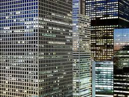 |
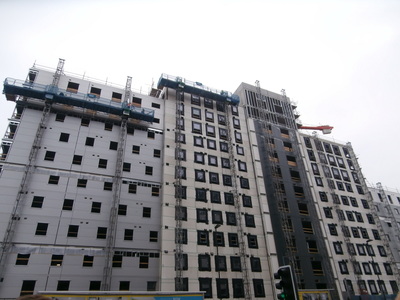
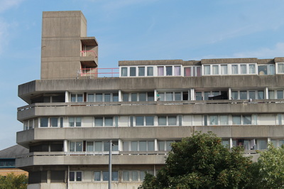
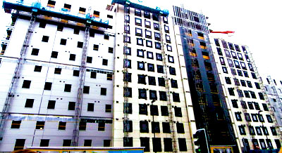
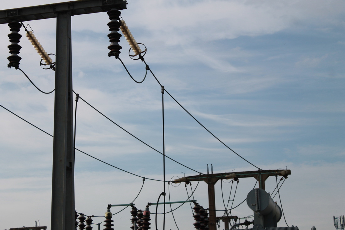
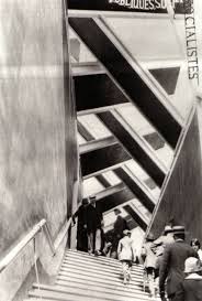
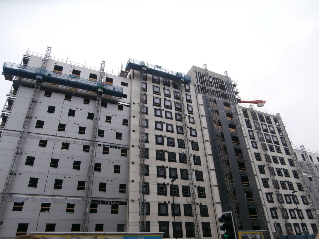
Michael Wolf has used the urban landscape of many cities to inspire his work. His photographs show the patterns and repetition within the architecture of these centres of human population. He has framed each image to focus the viewer's attention on the structures that overlap. In some of his photographs he has captured a moment of human interaction within these permanent gigantic structures. He positions himself at the same height as the buildings he is photographing so that the vertical lines within the buildings are not effected by lines of perspective. This emphasises the repeated vertical lines which show power and strength.
|
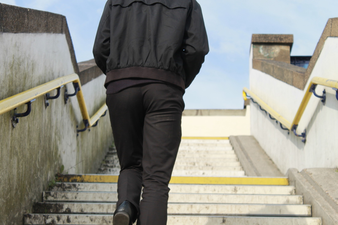
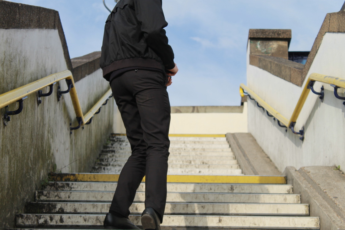
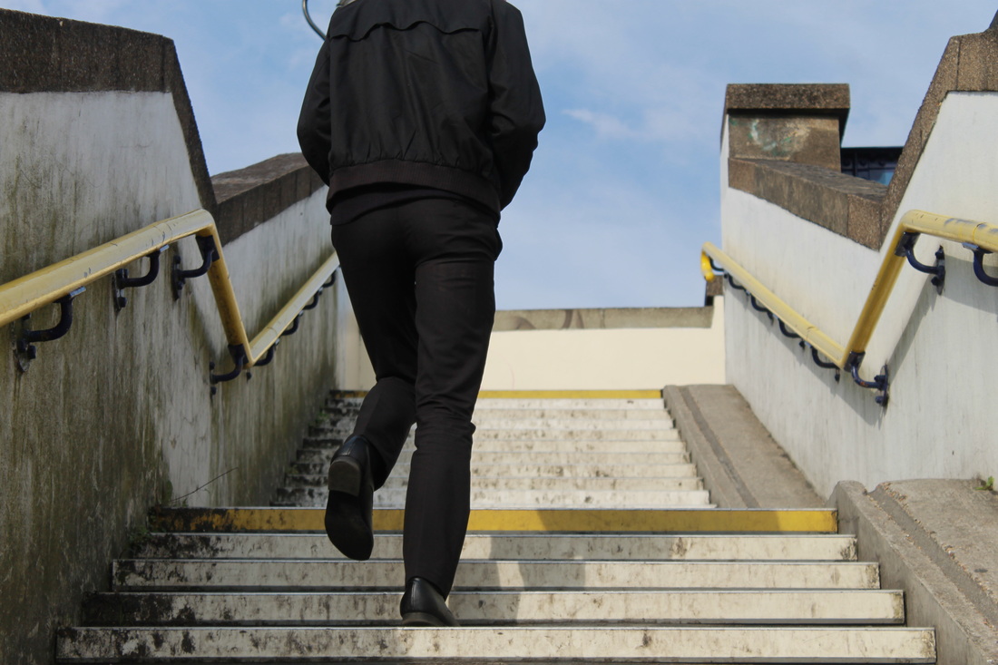
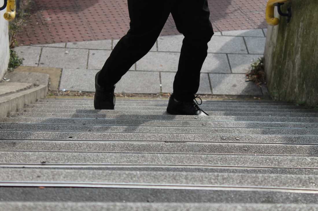
My response to Micheal Wolf


Refining my response to Micheal Wolf
|
|
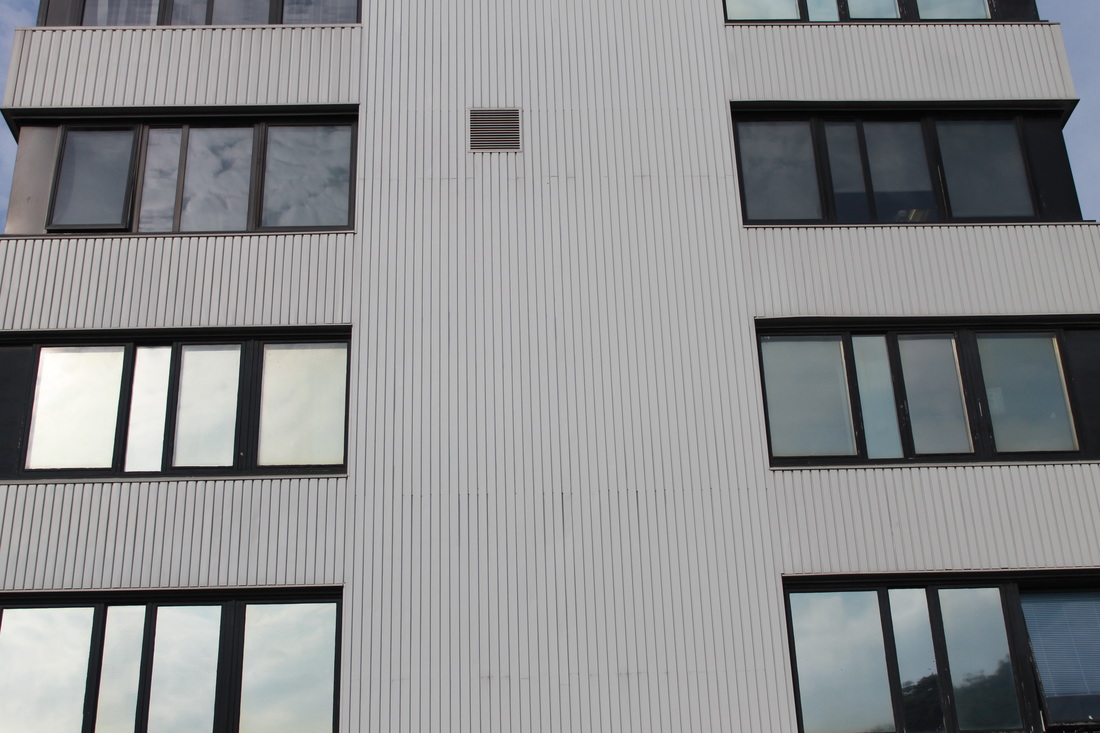
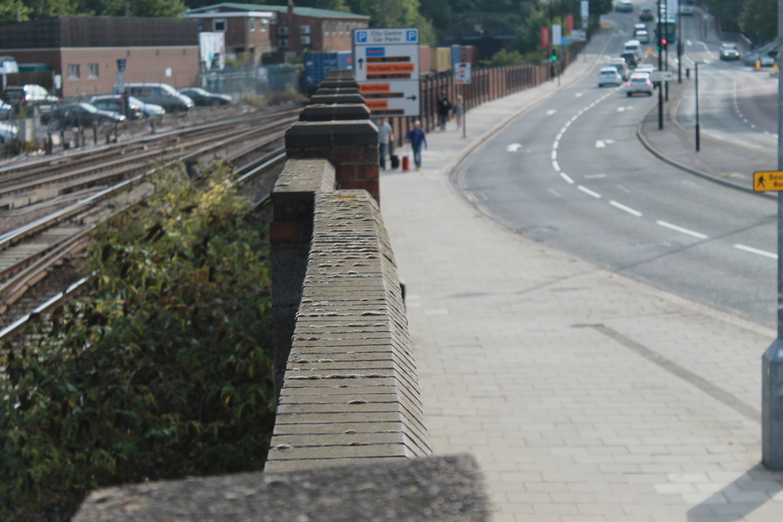
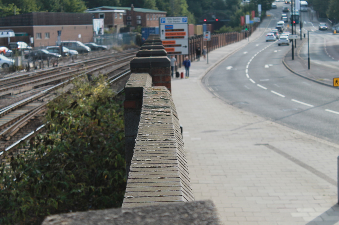
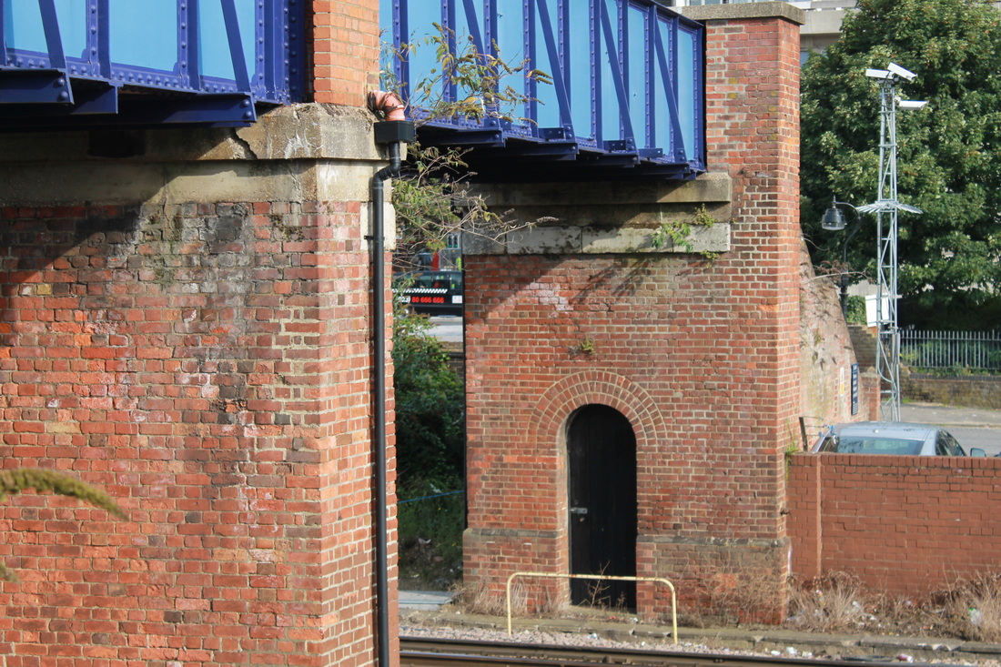
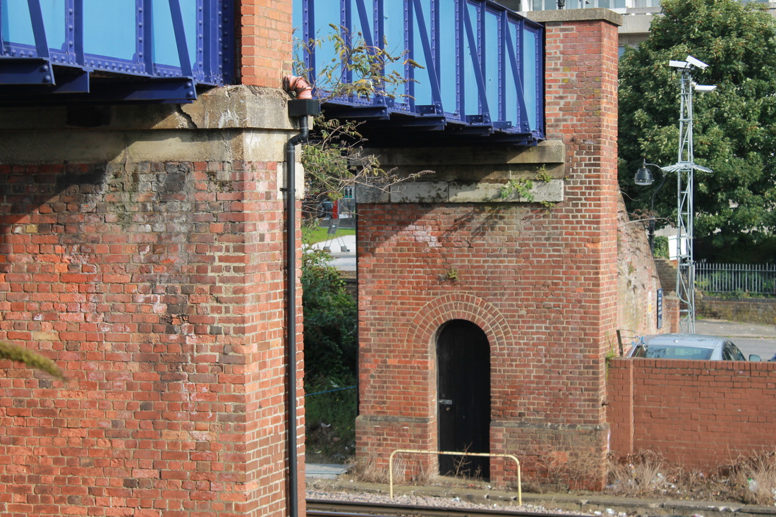
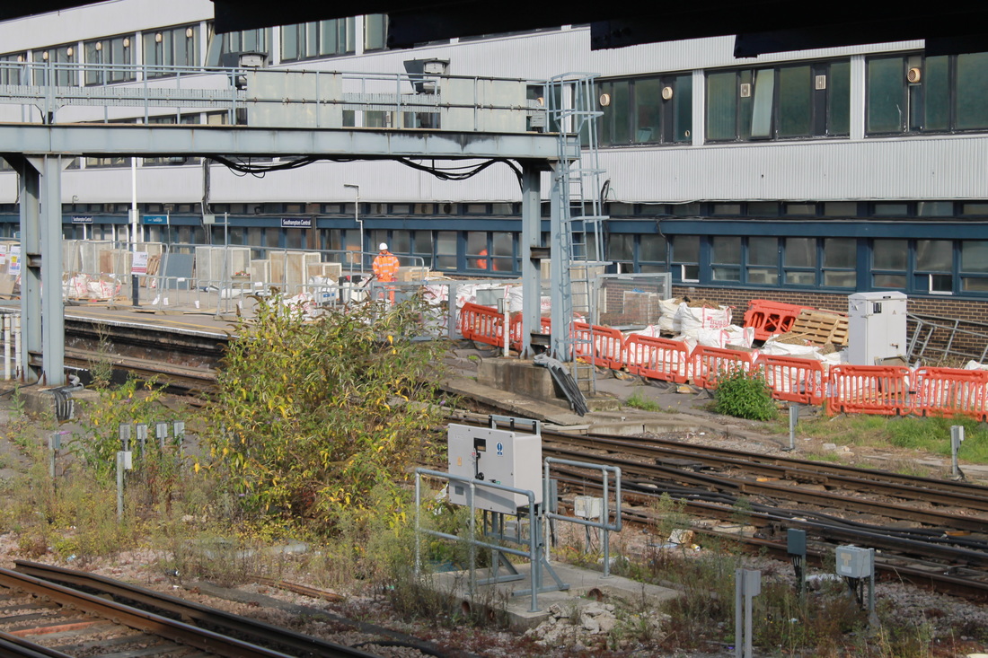
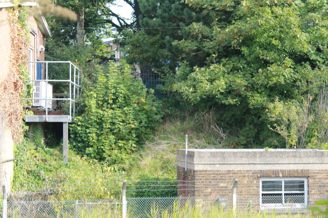
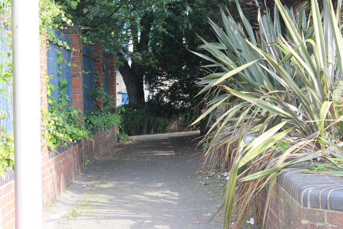
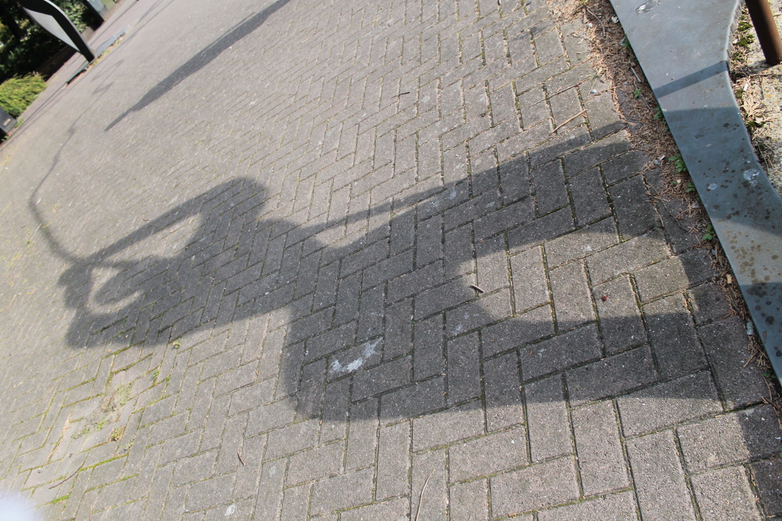
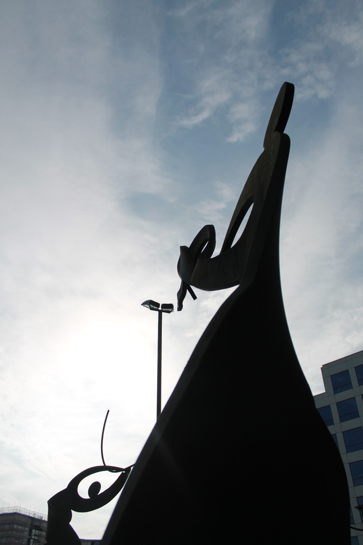
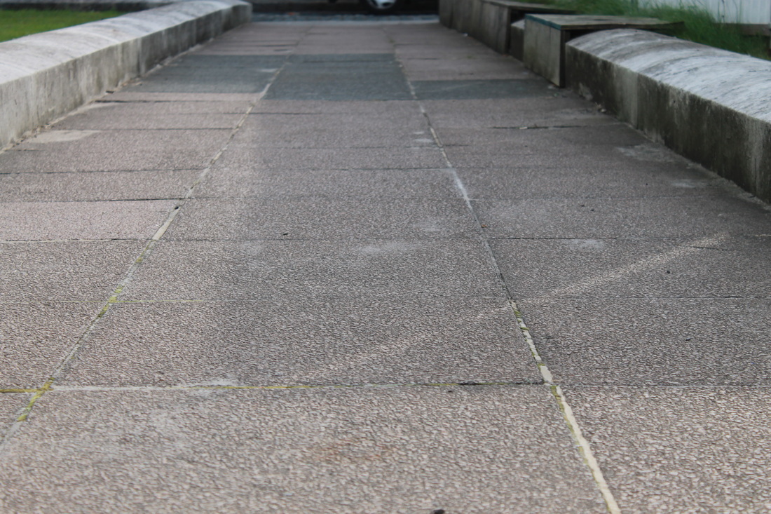
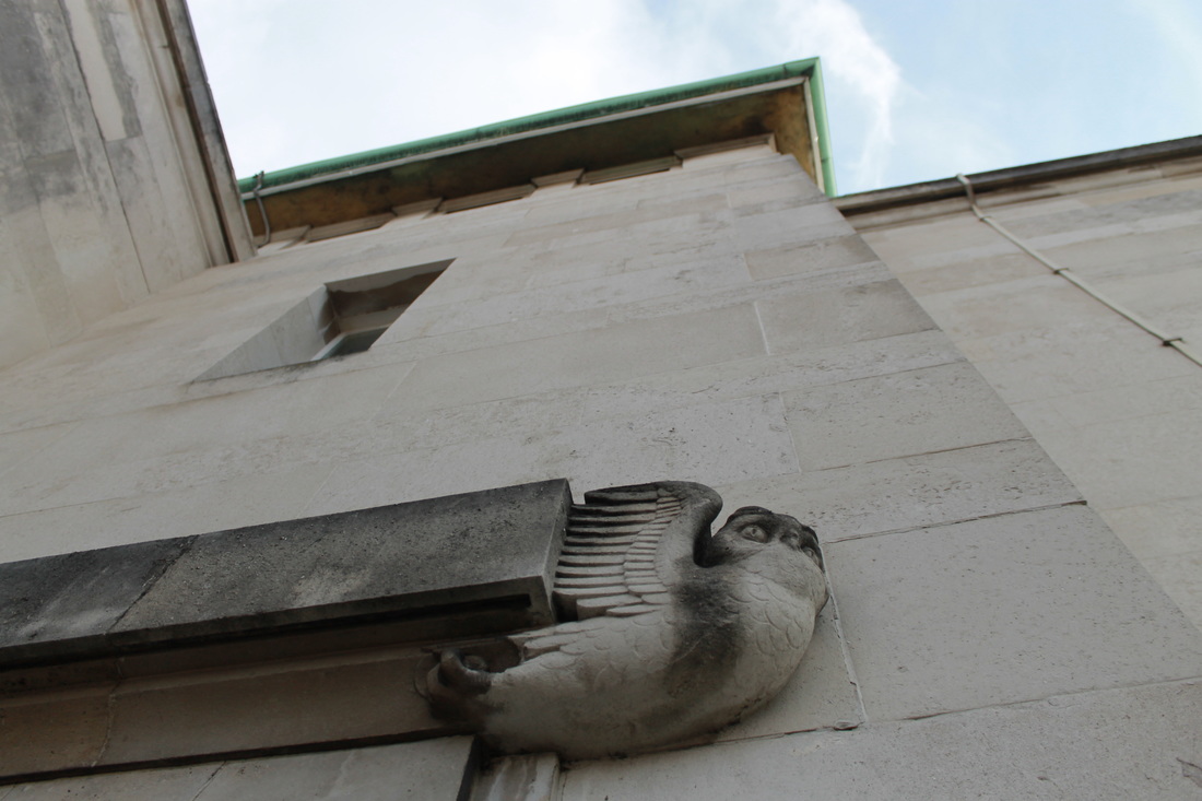
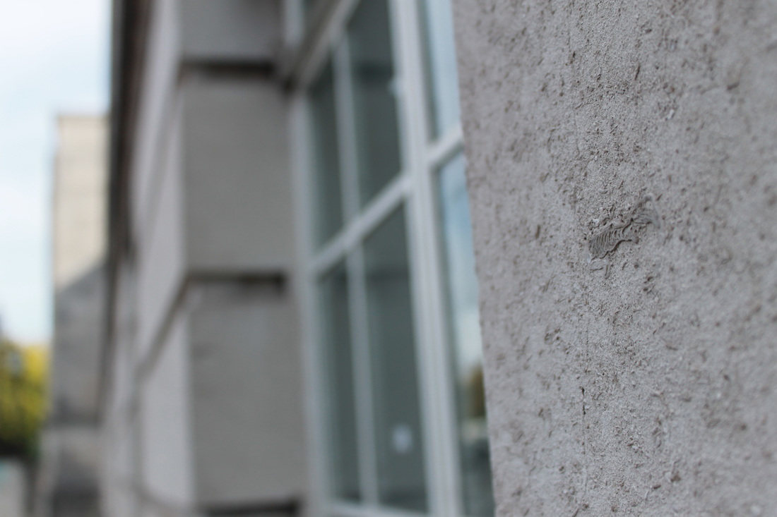
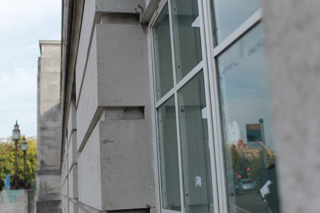
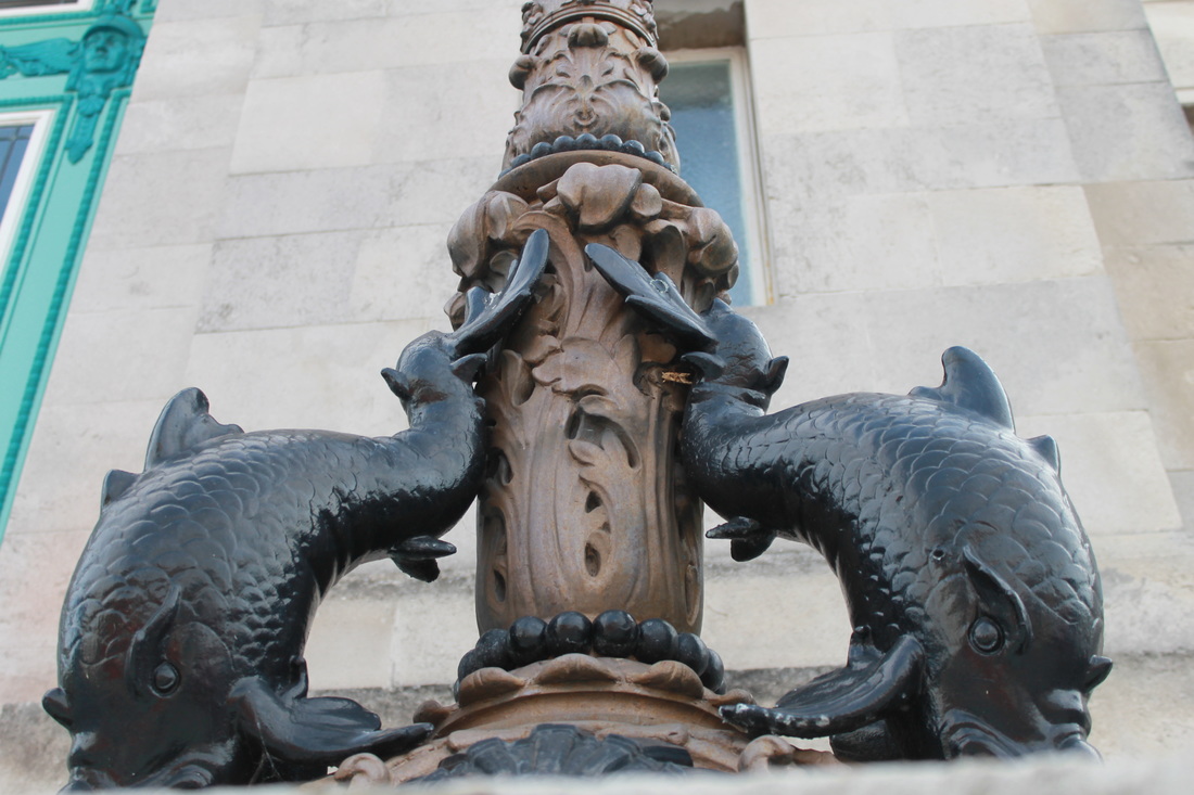
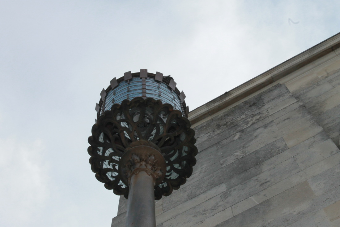
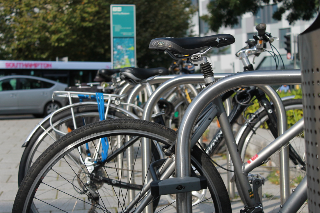
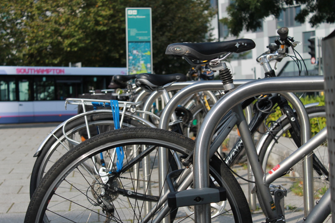
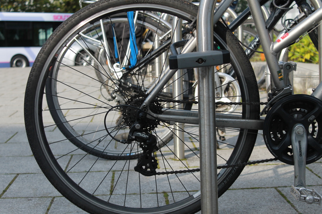
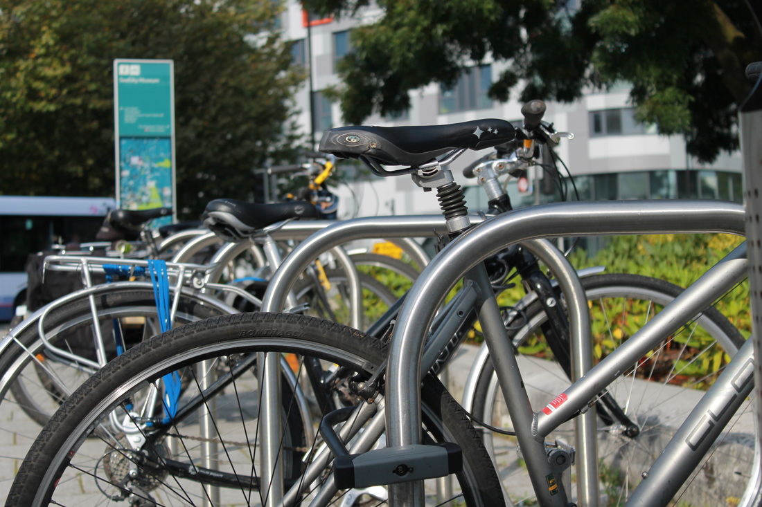
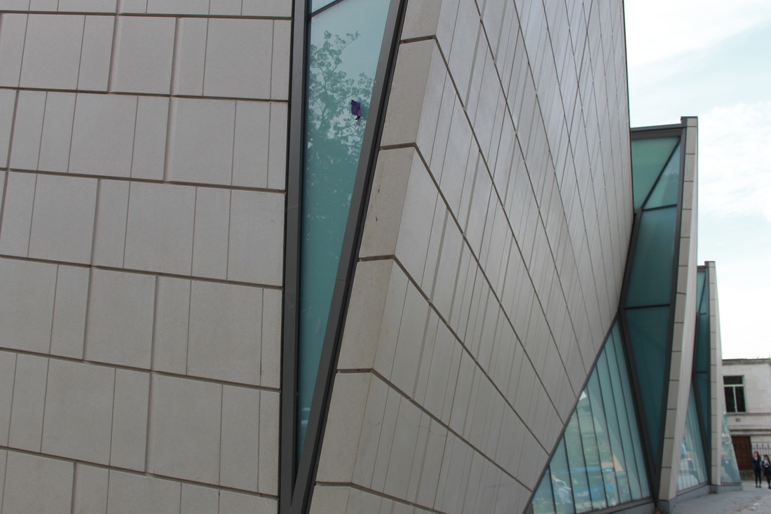
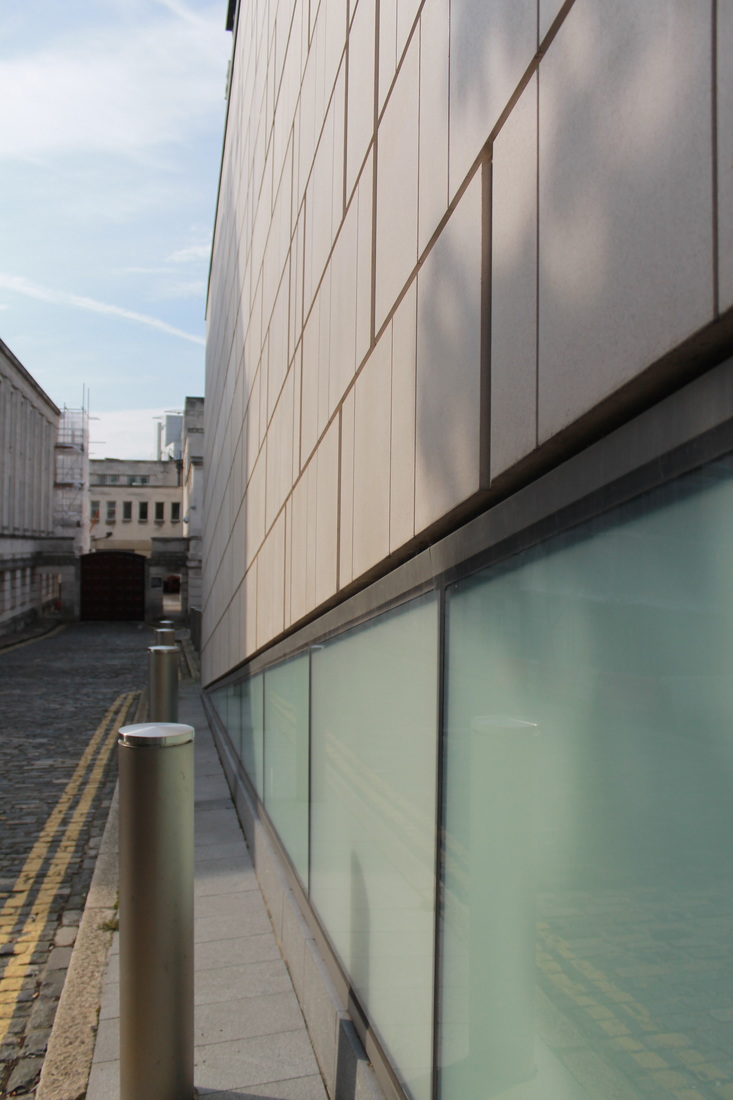
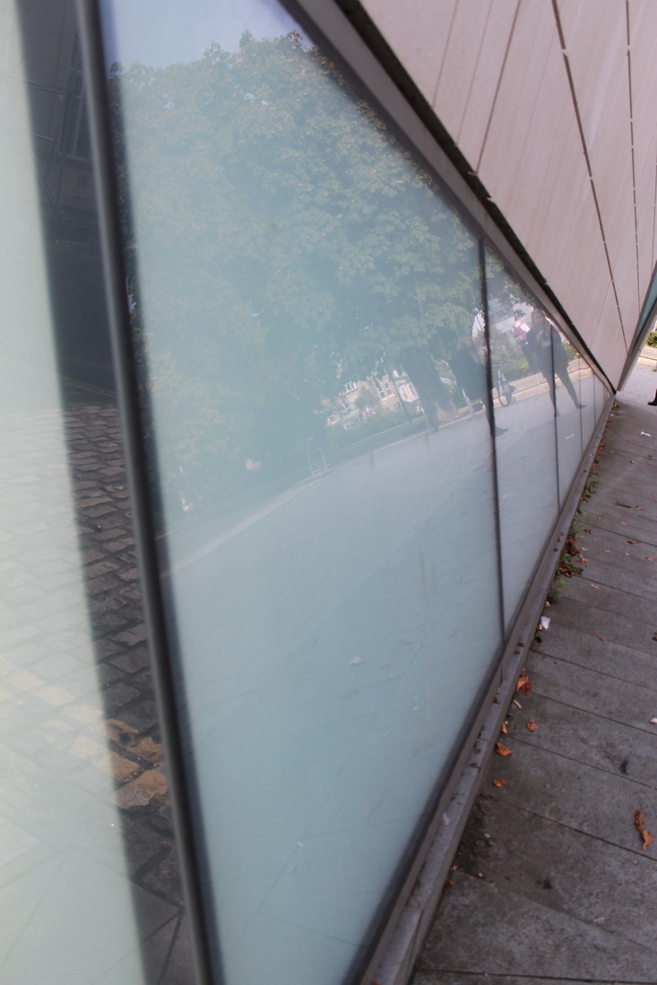
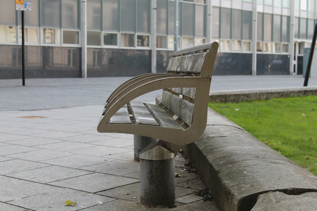
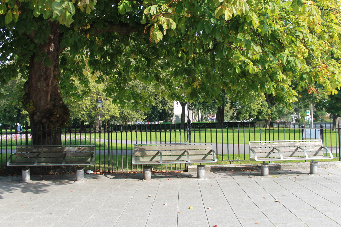
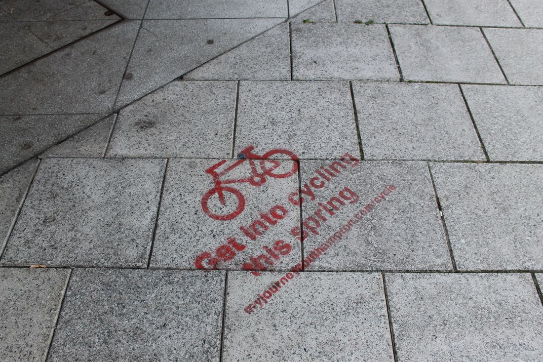
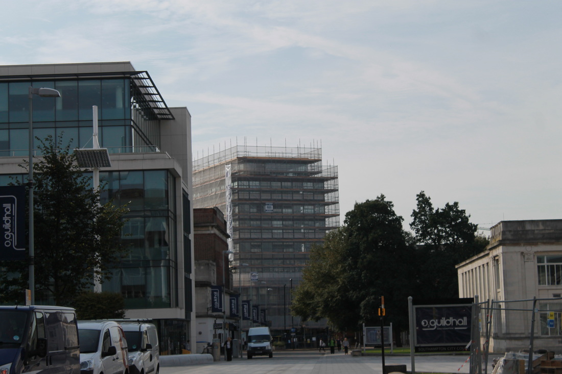
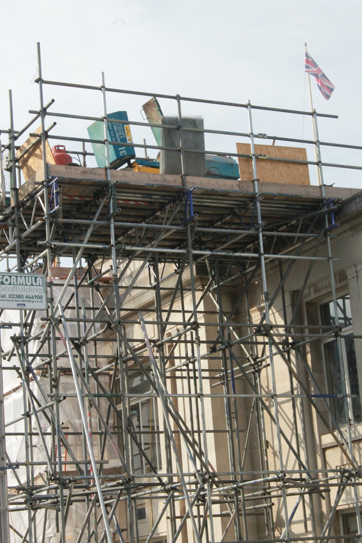
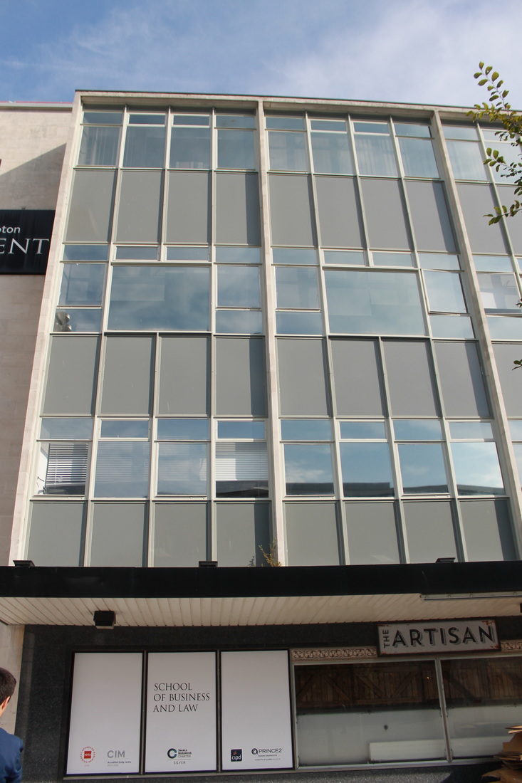
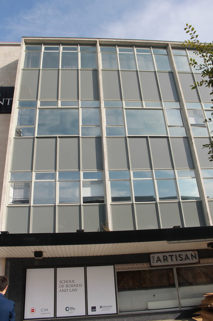
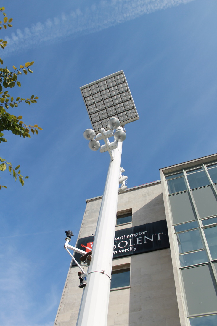
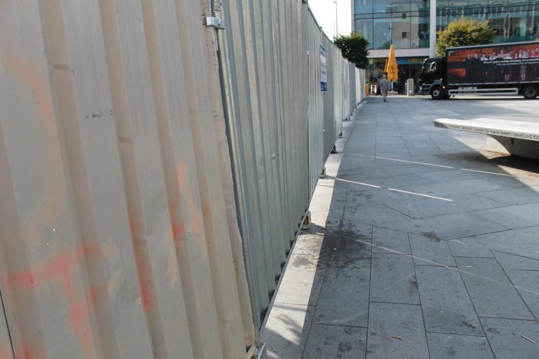
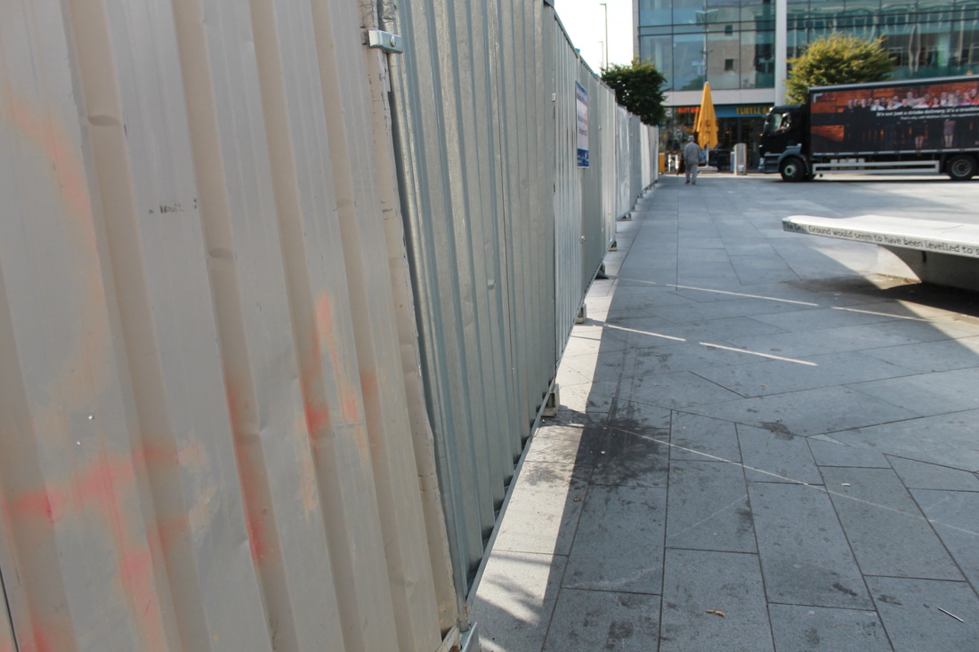
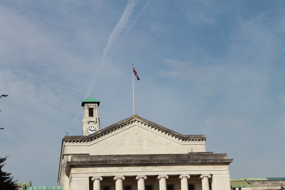
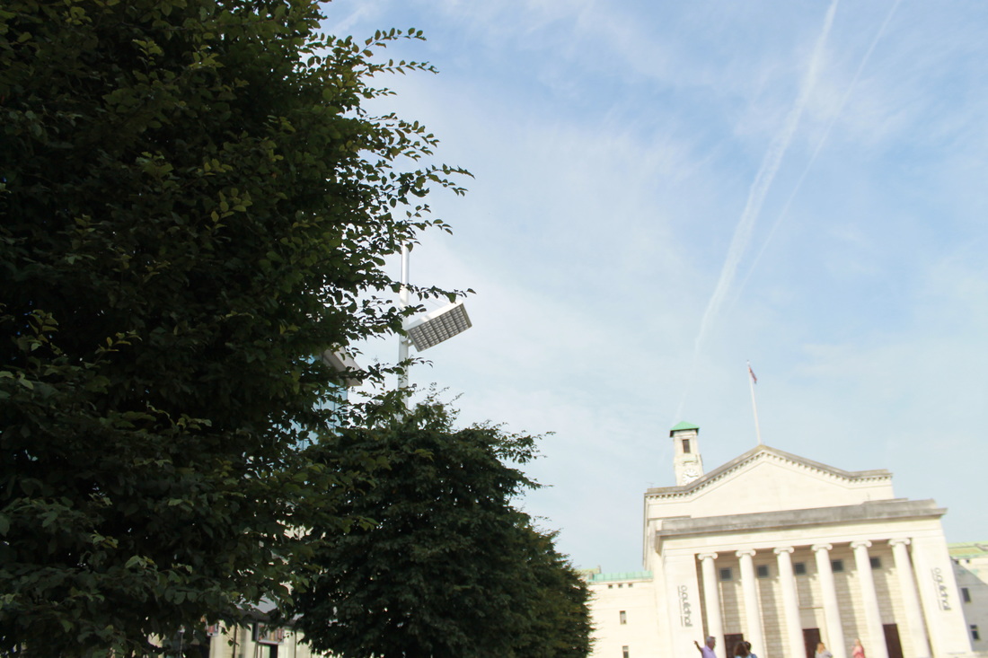
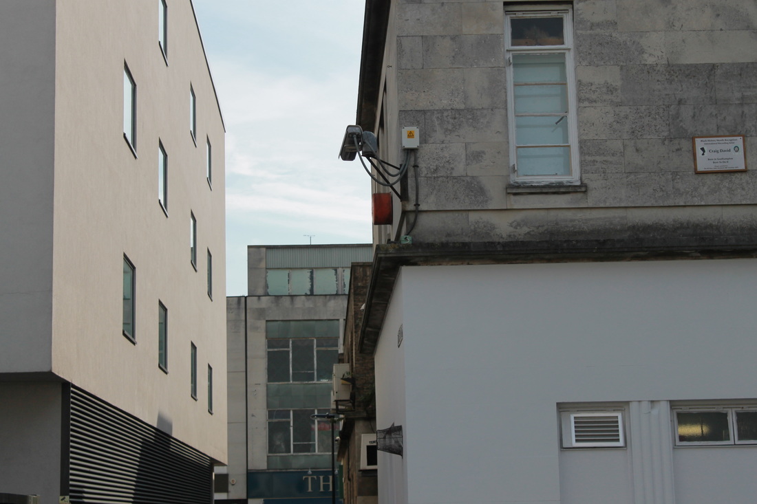
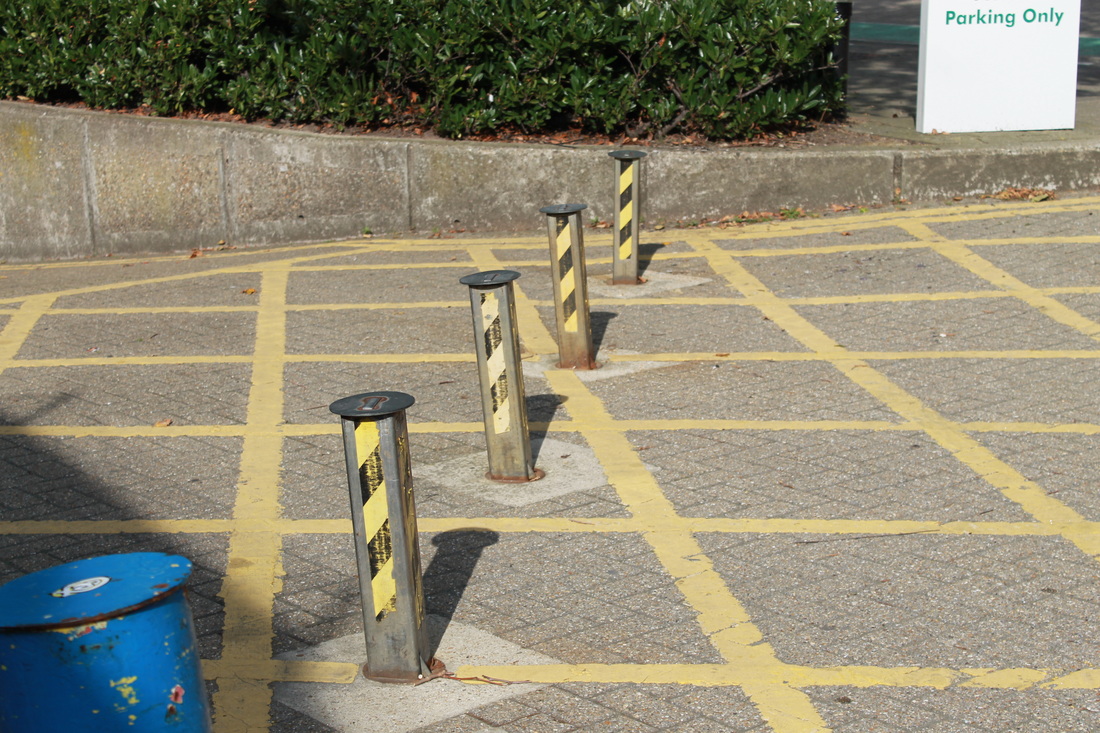
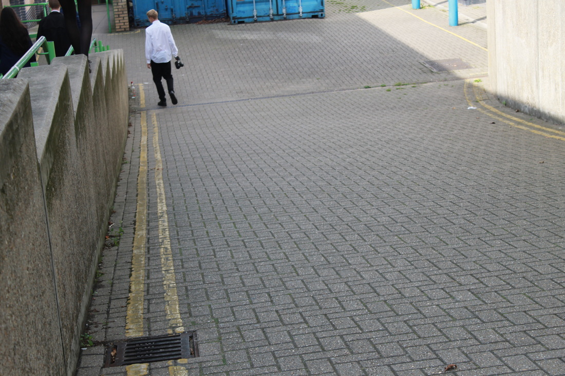
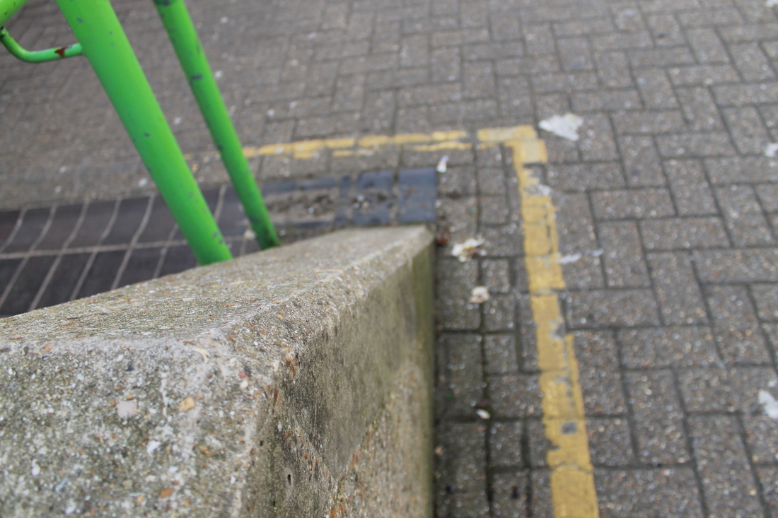
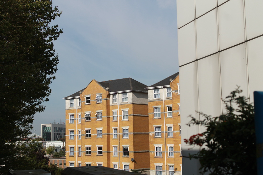
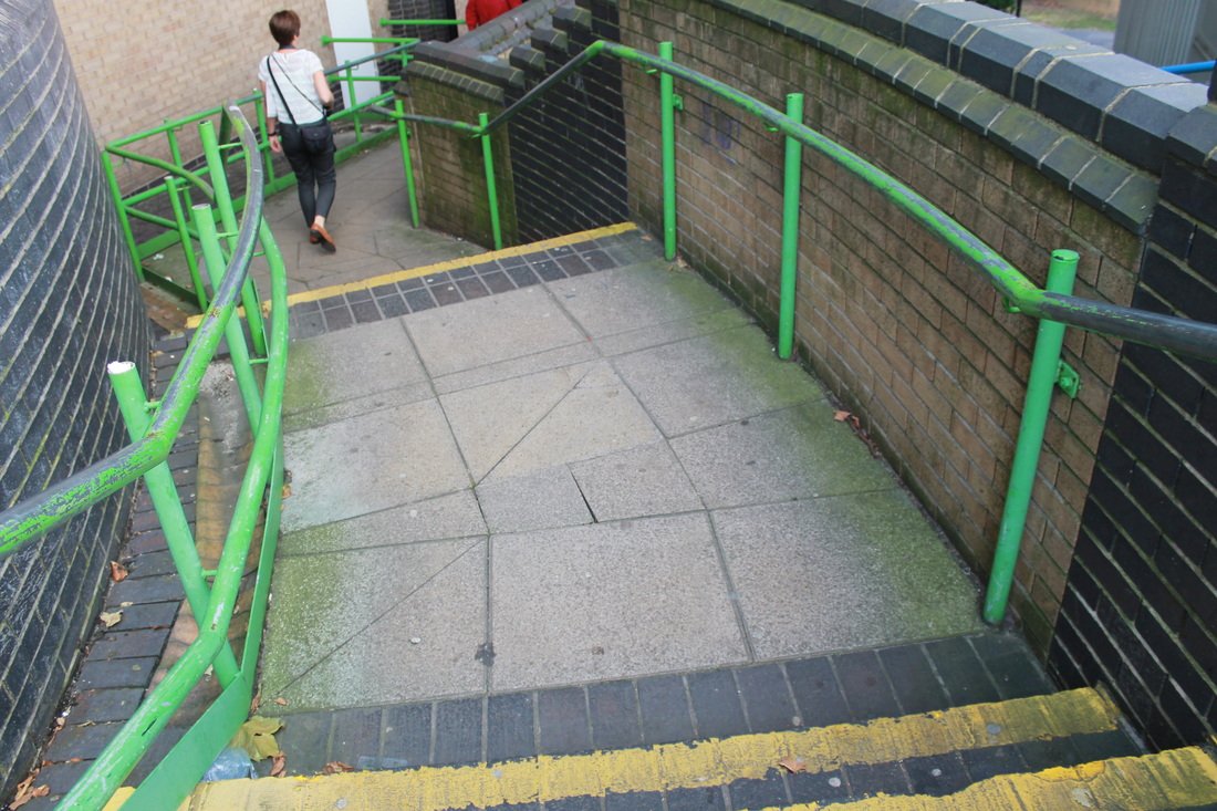
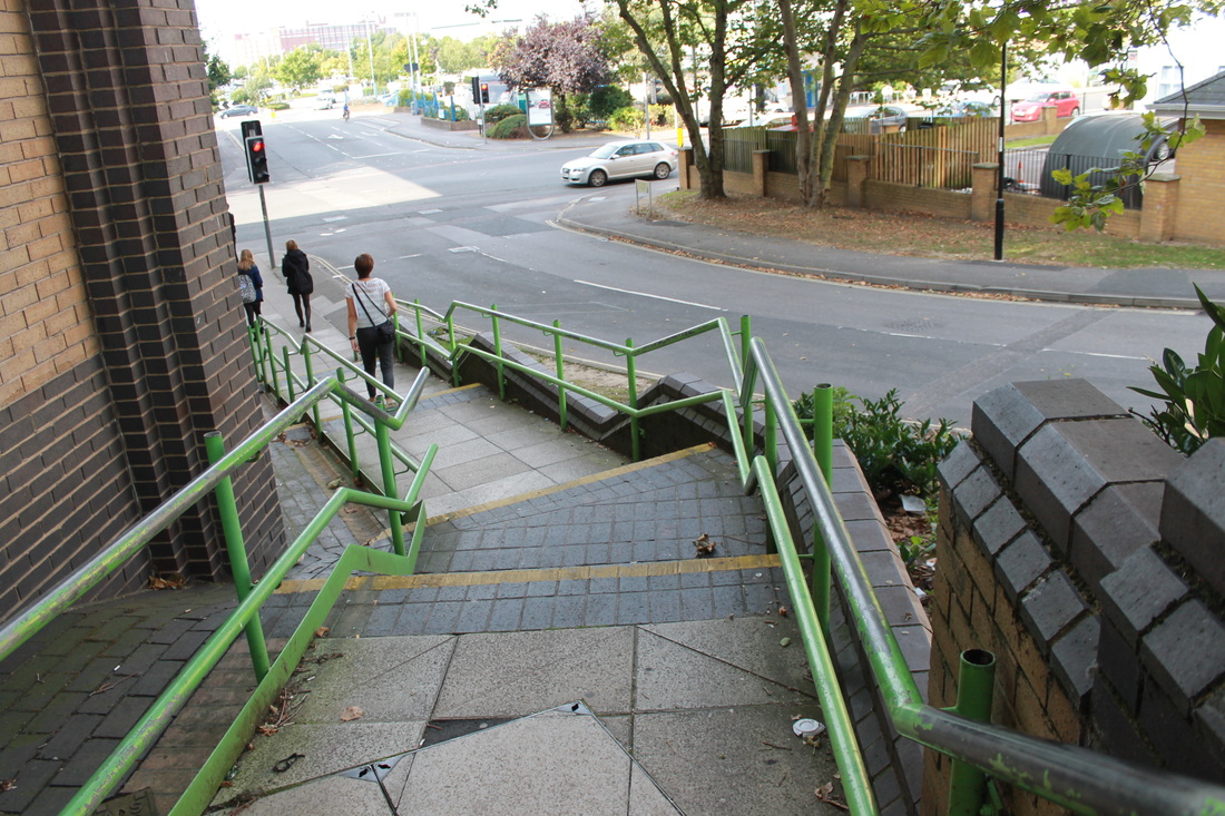
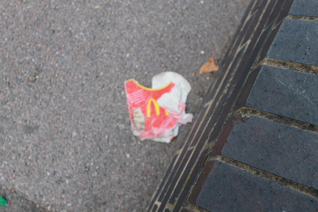
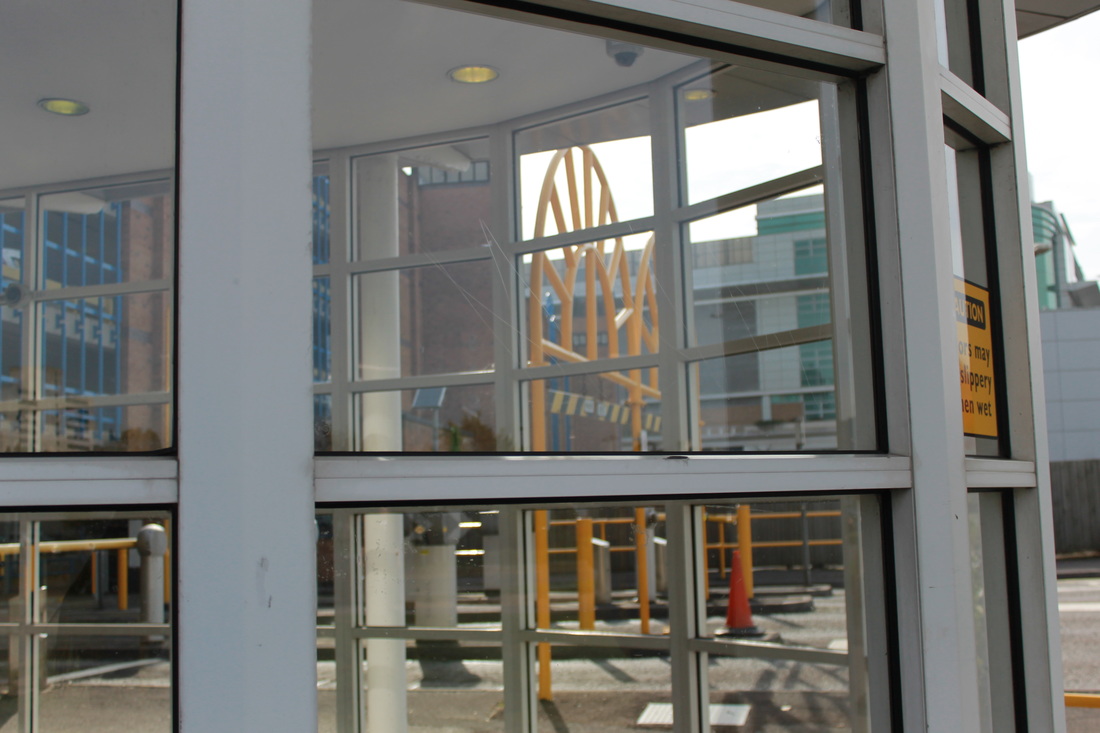
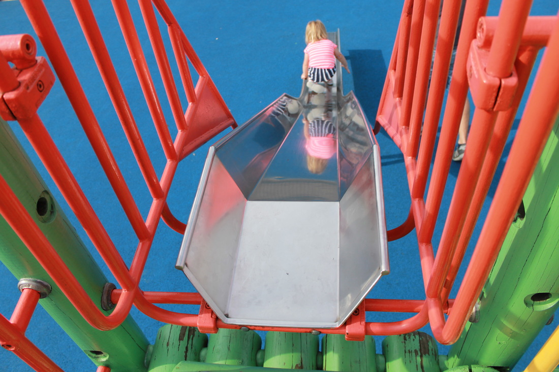
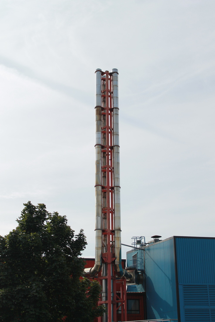
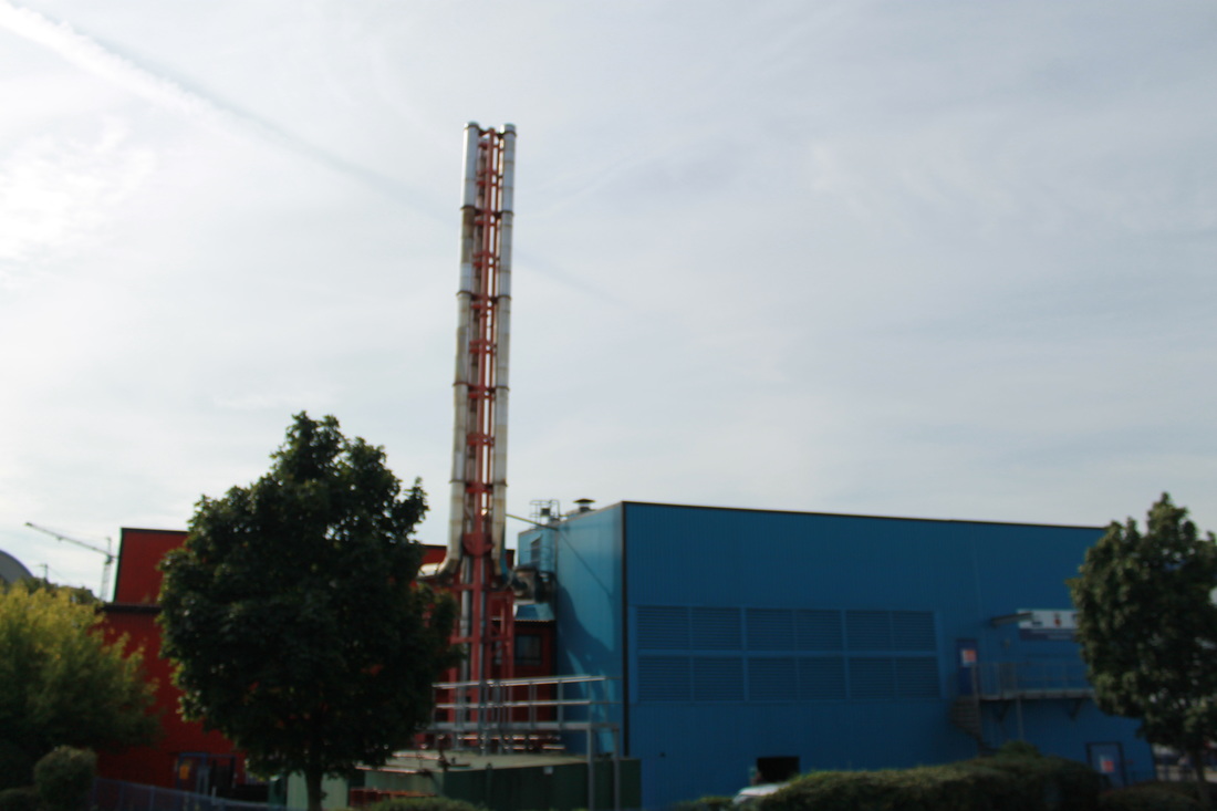
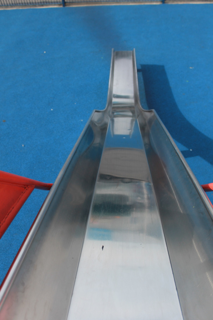
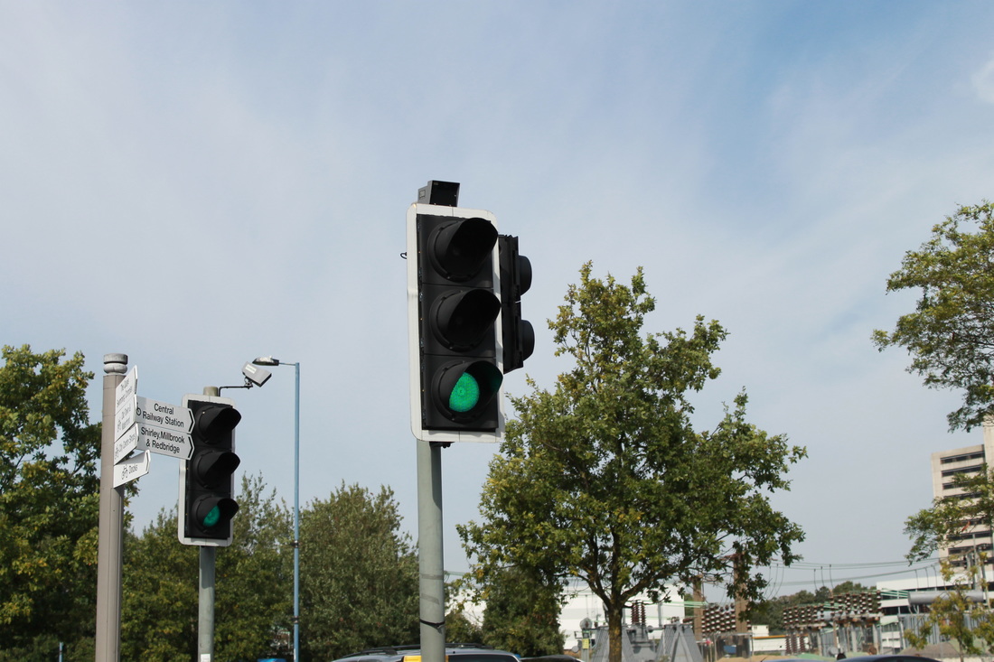
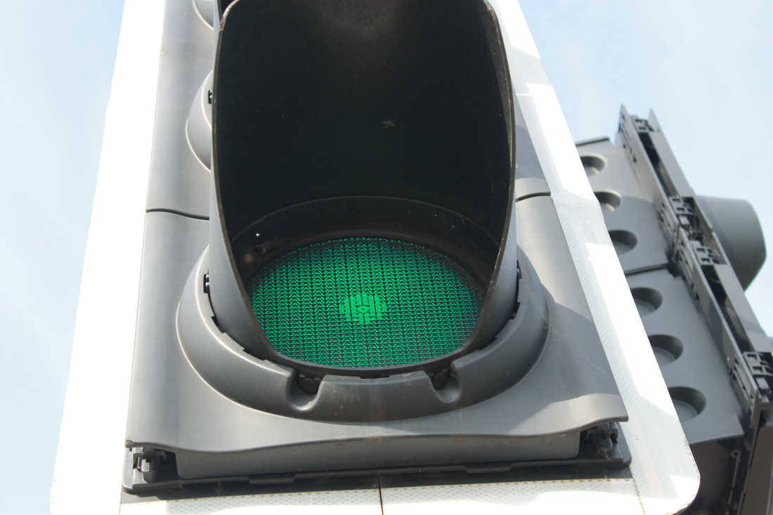
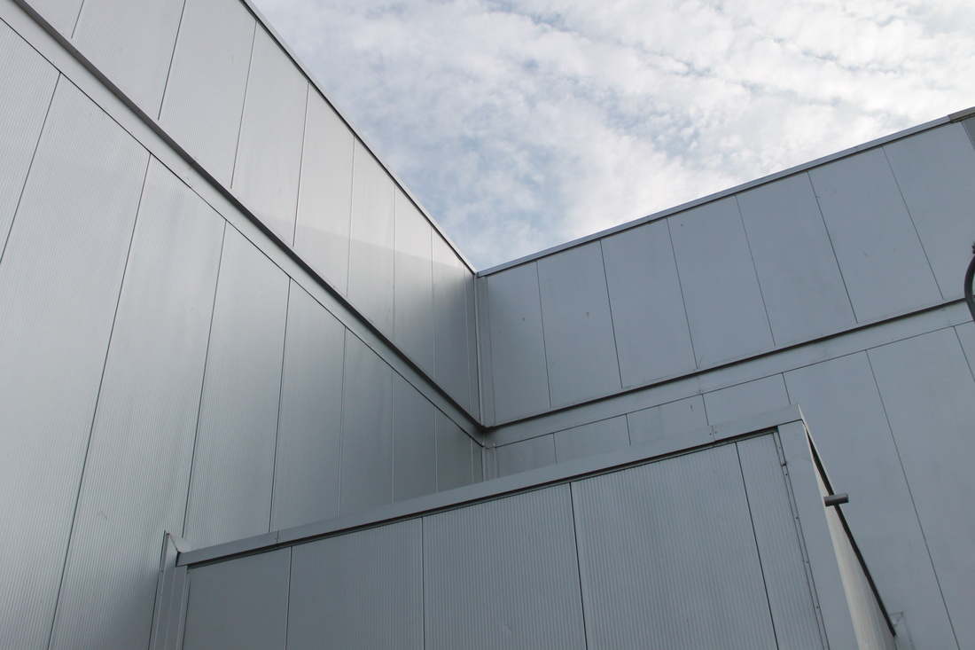
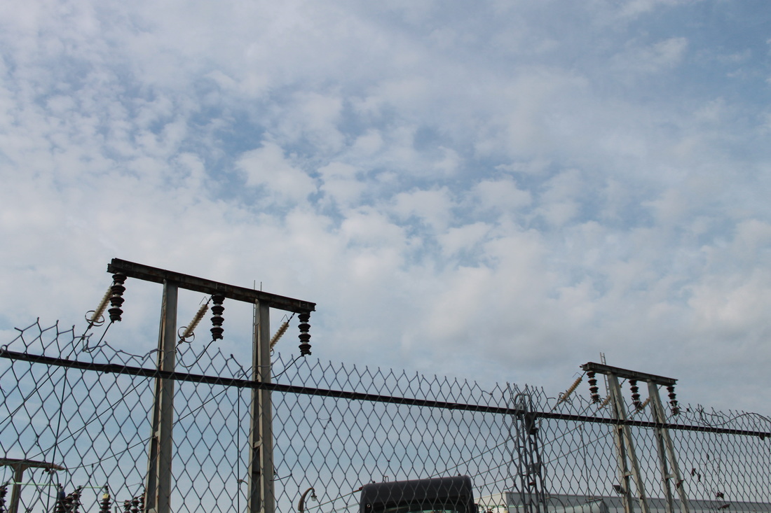
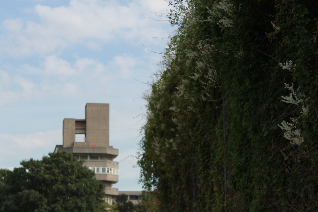
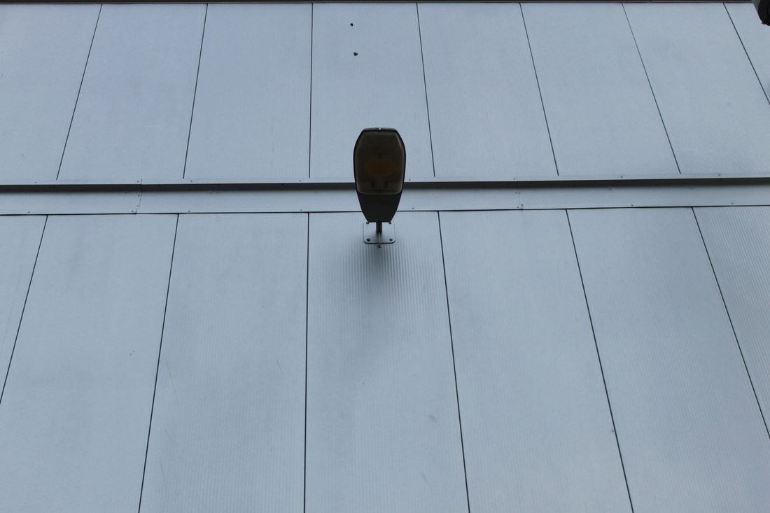
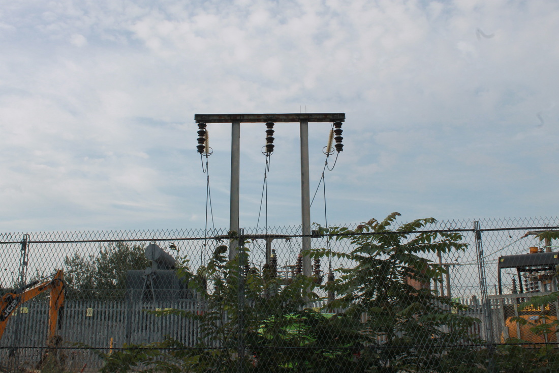
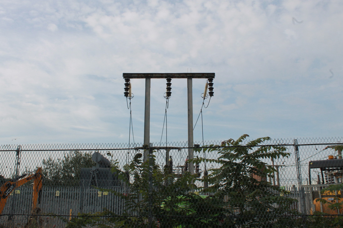
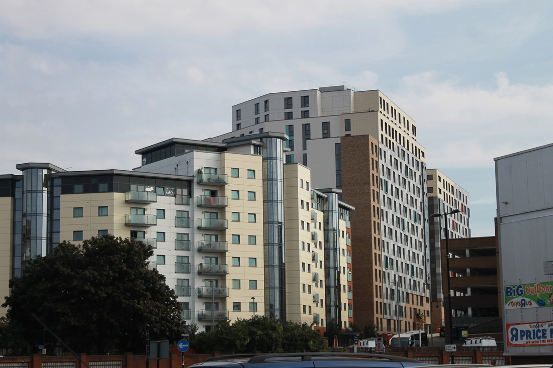
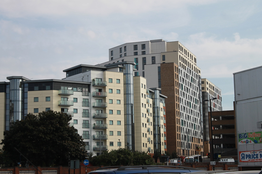
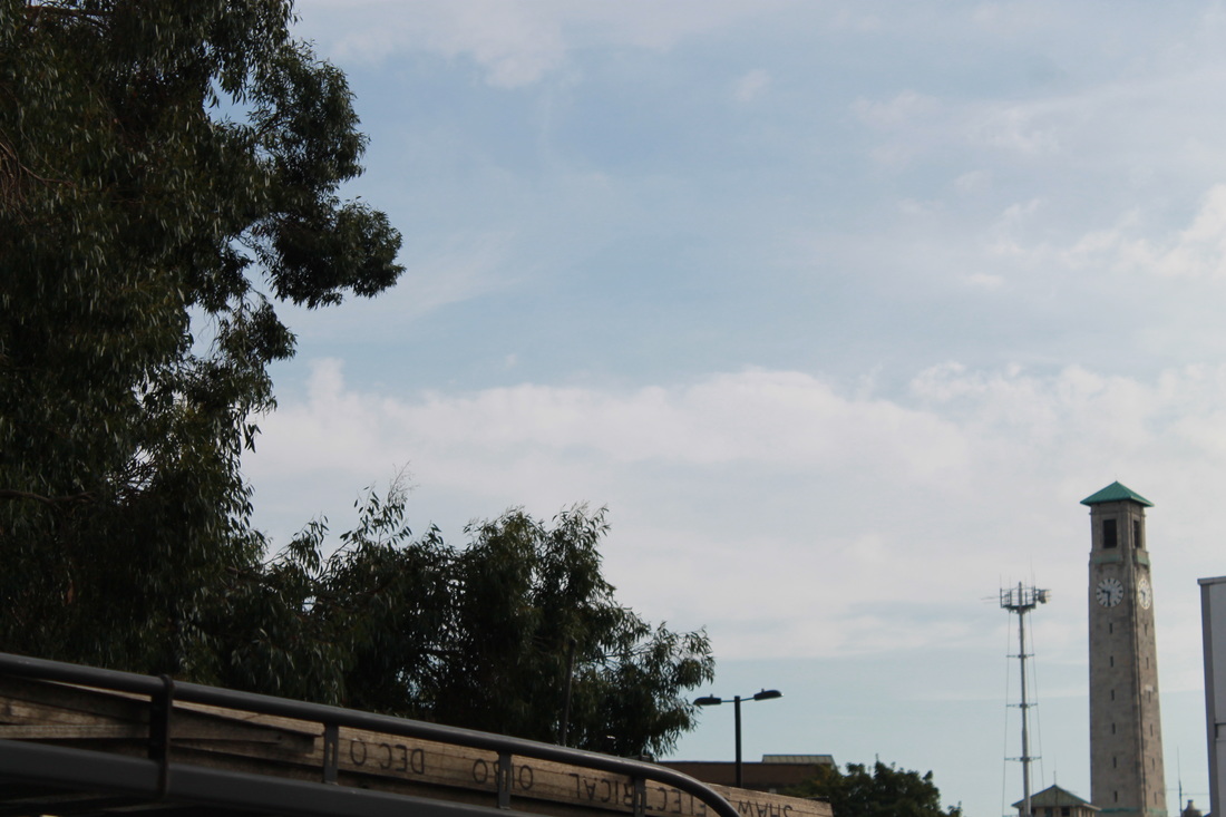
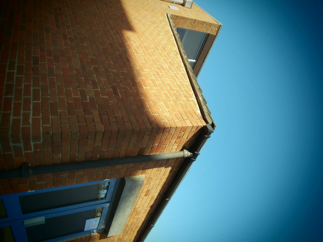
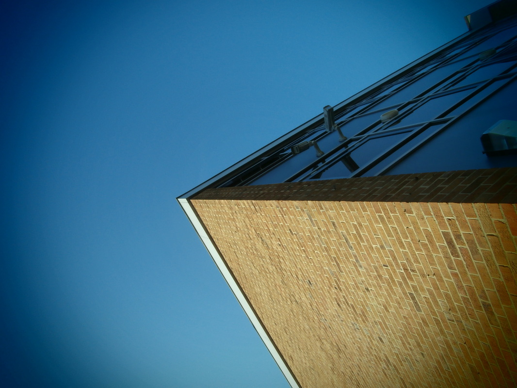
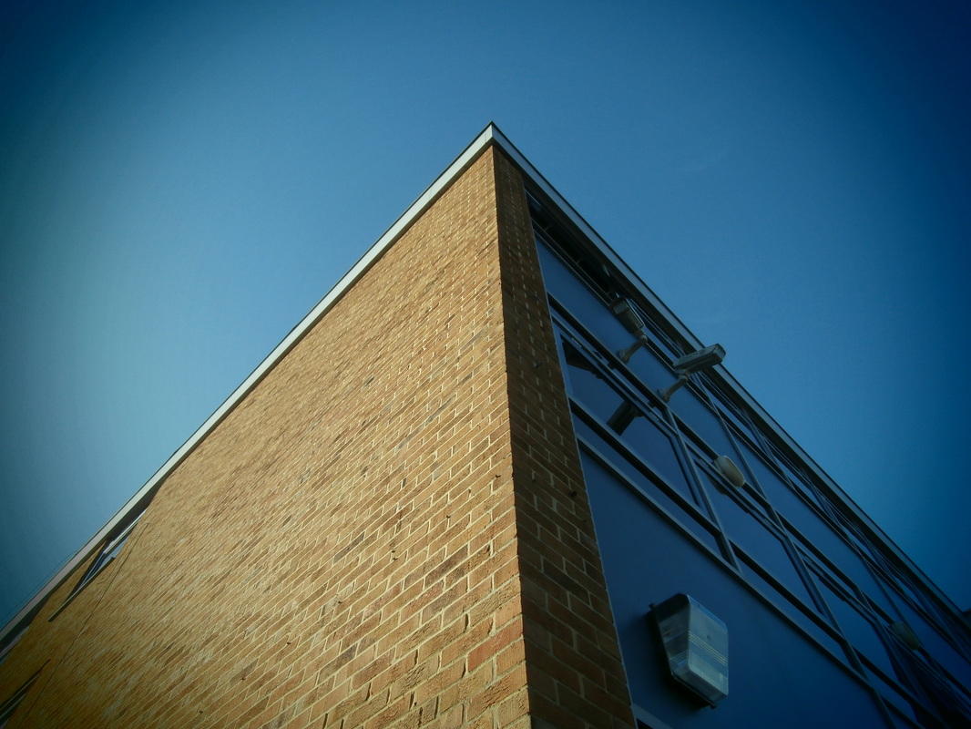
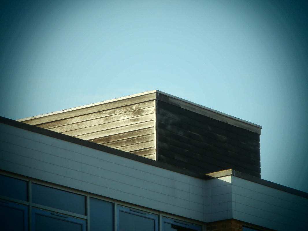
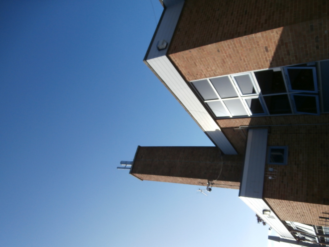
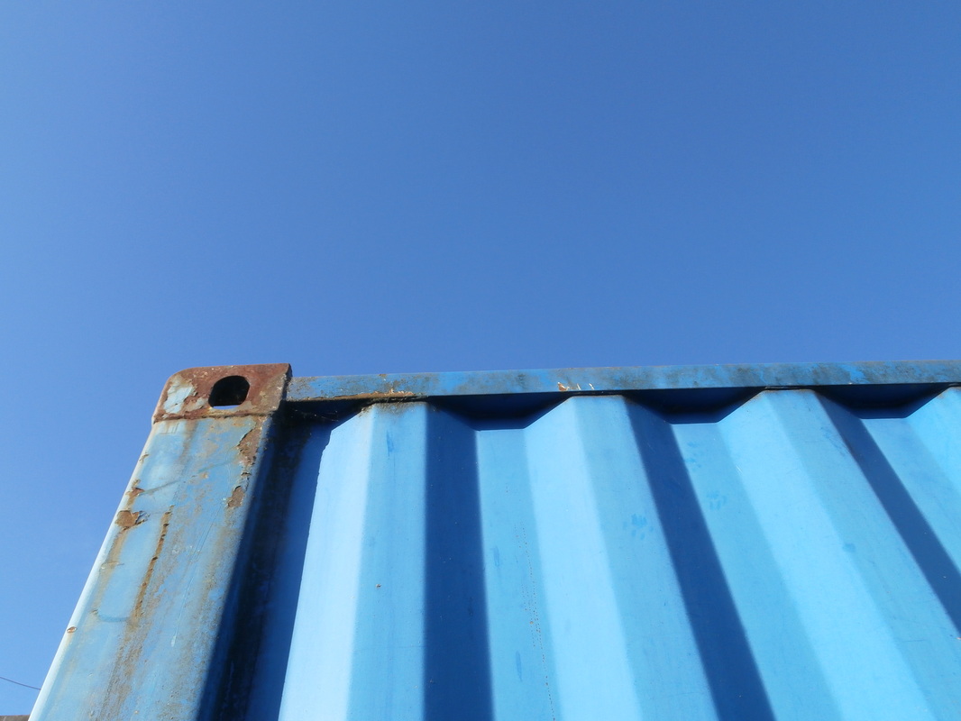
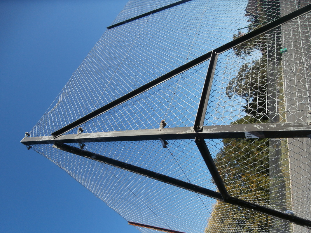
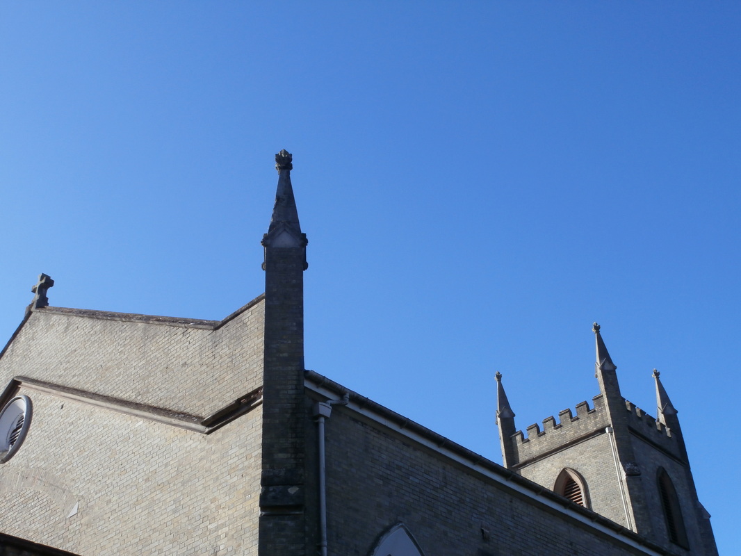
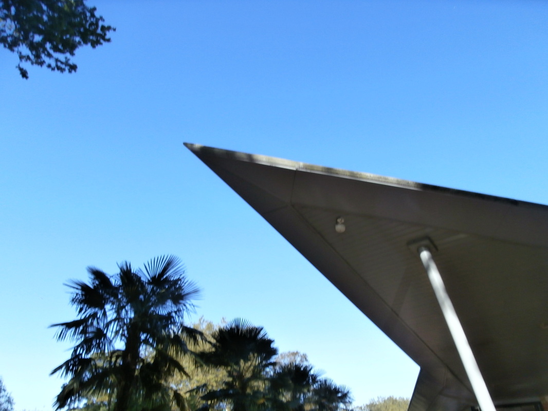
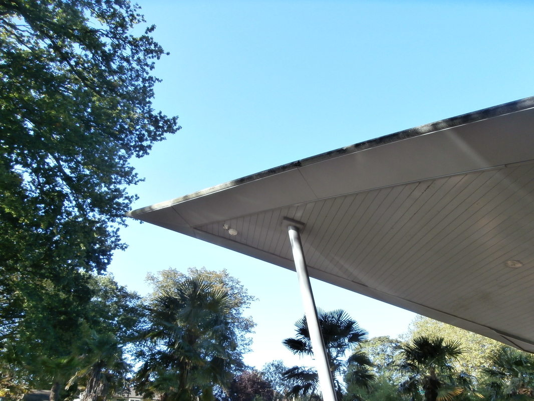
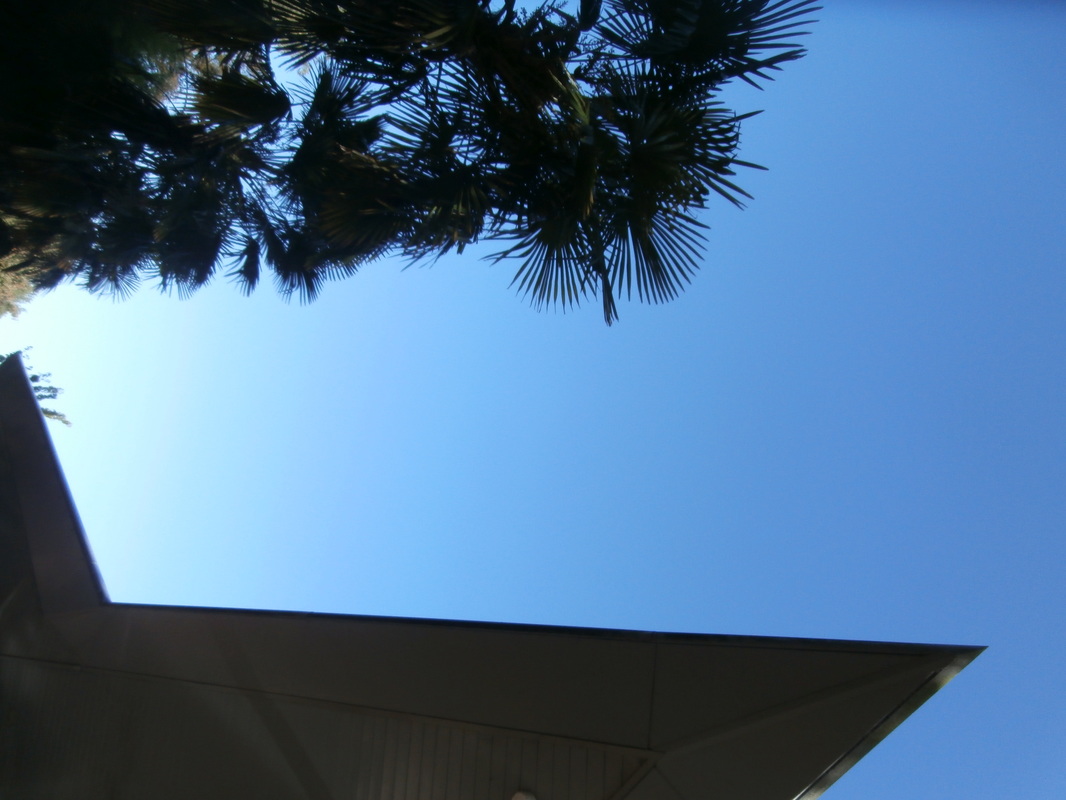
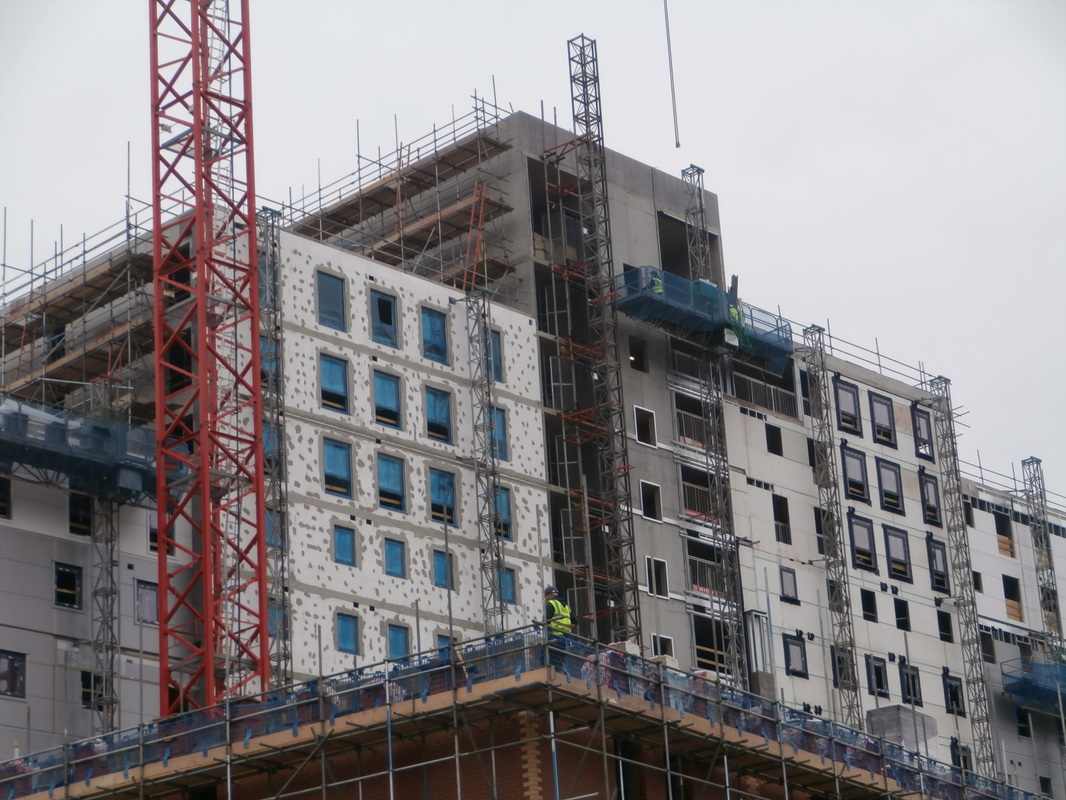
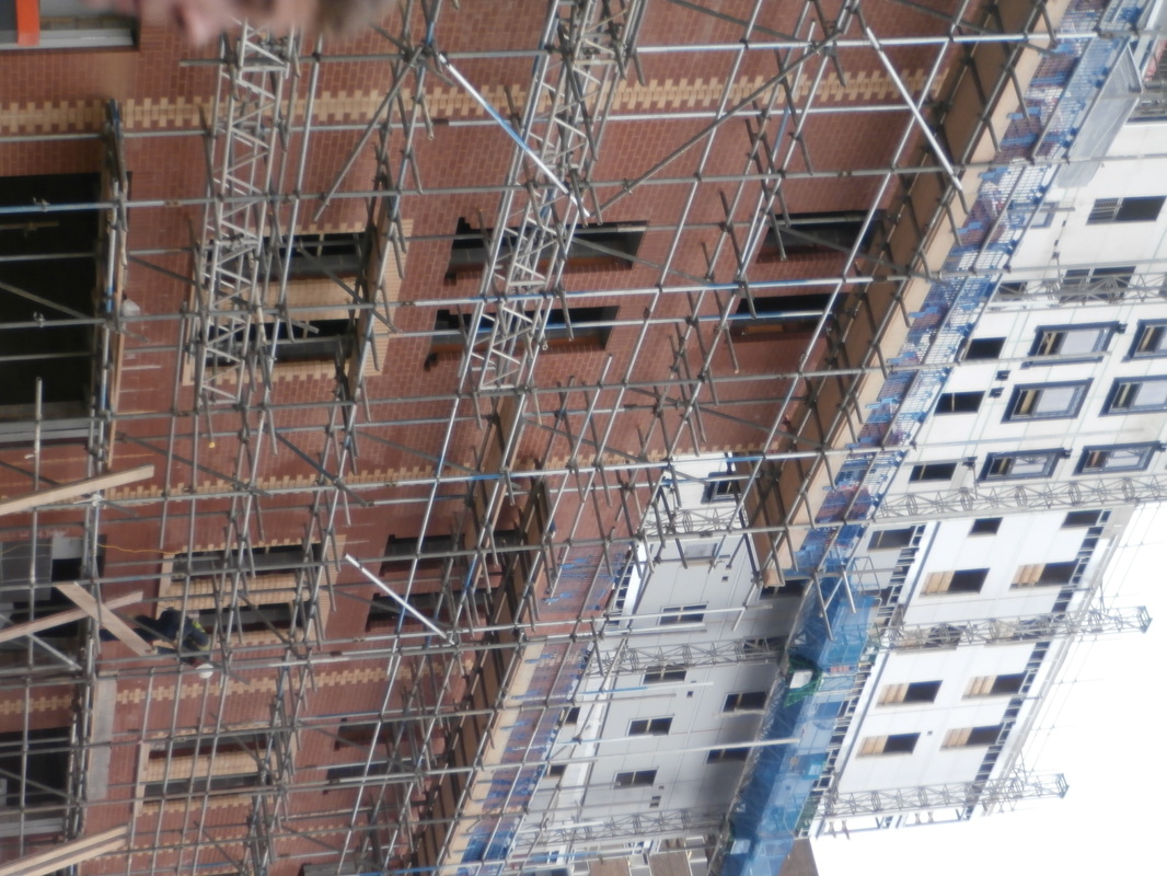
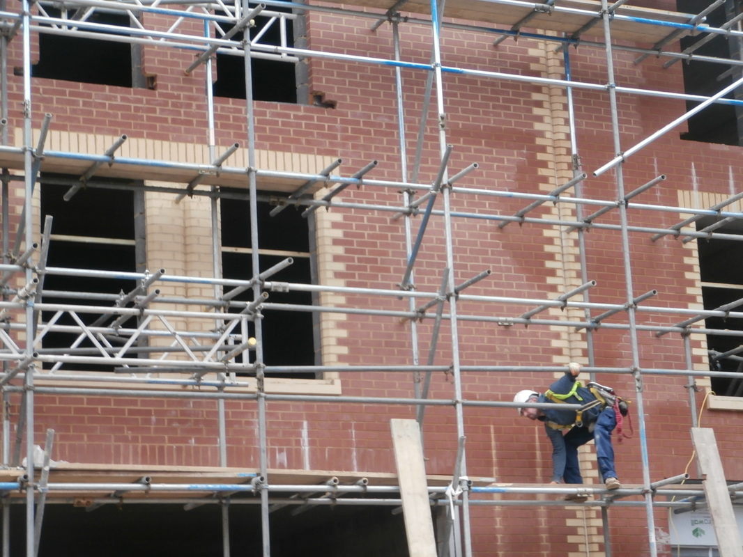
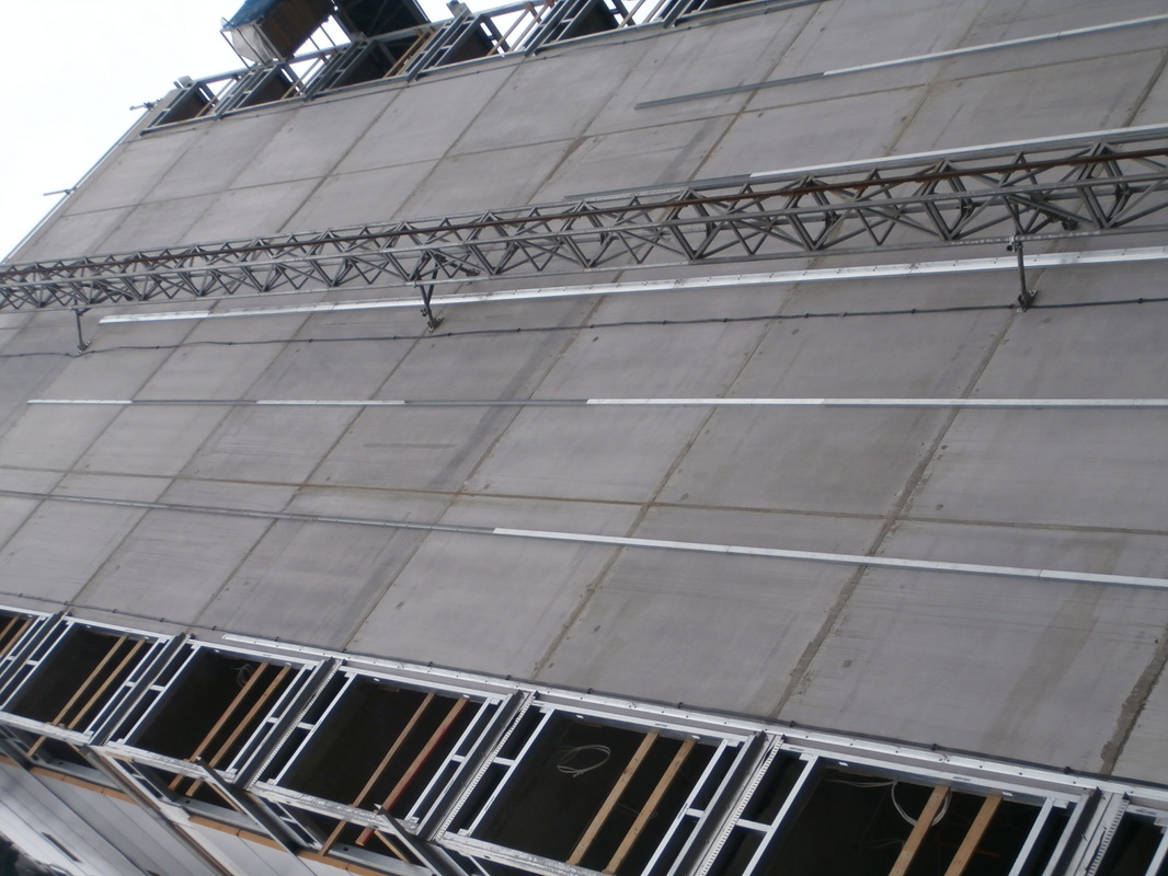
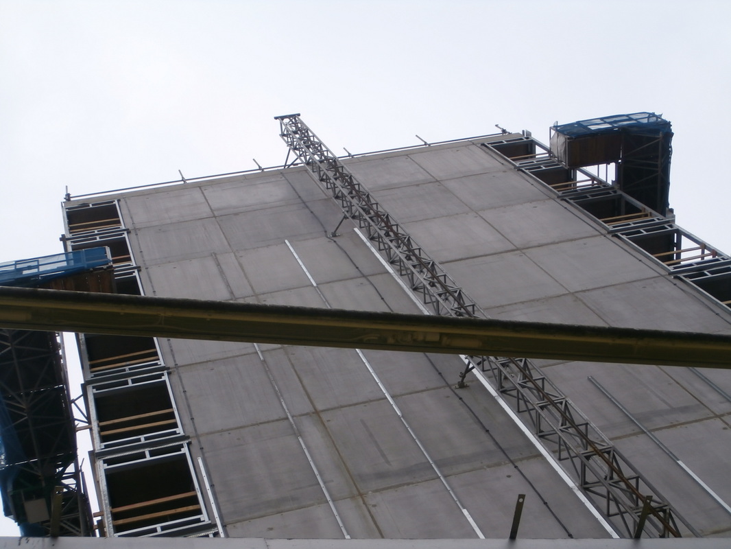
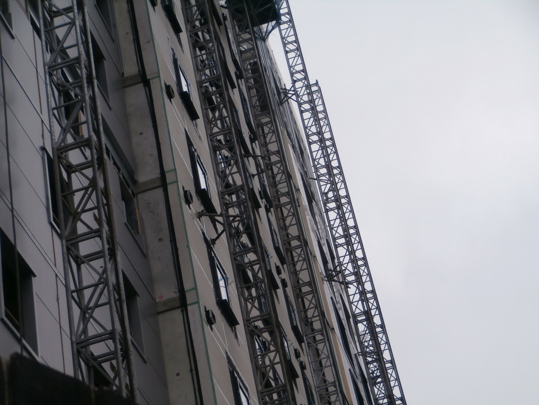
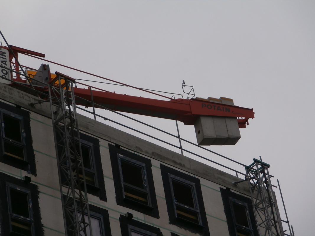
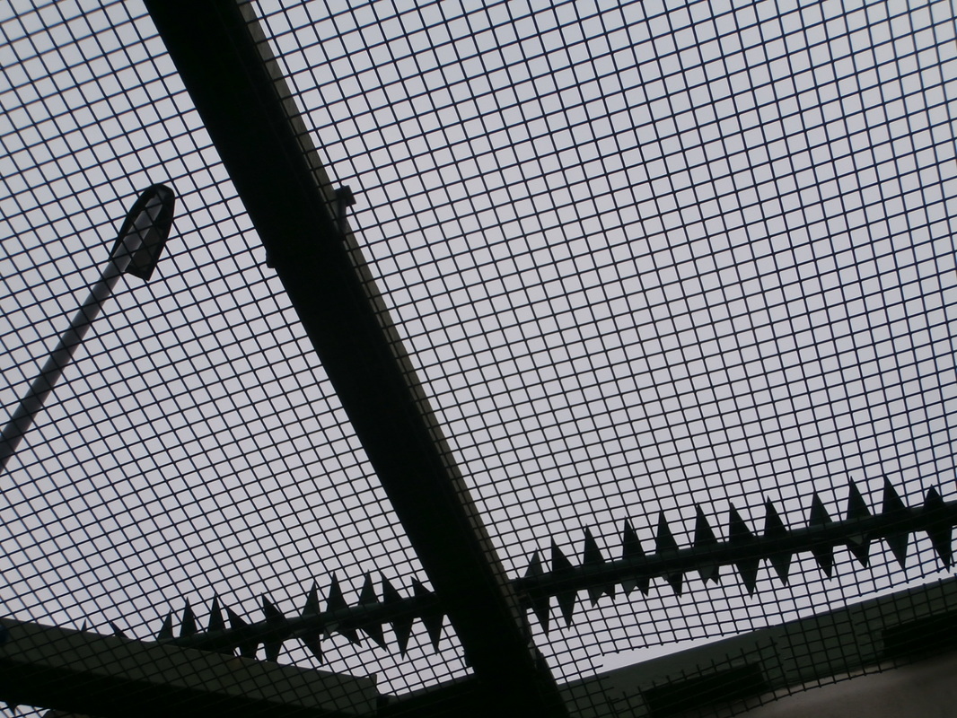
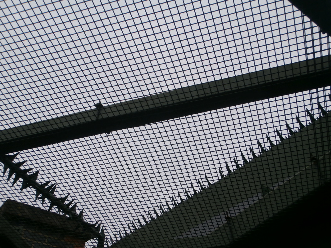
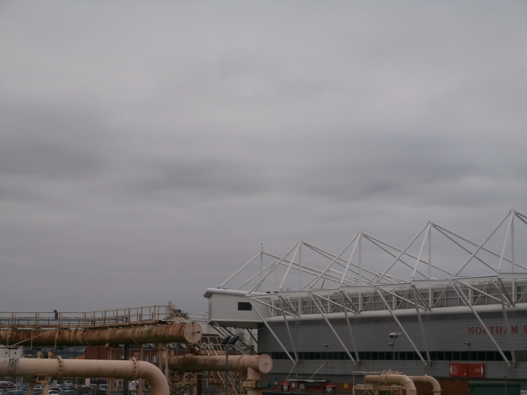
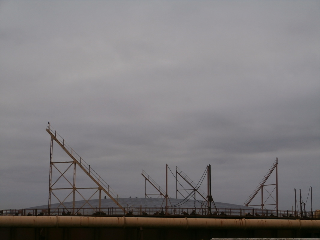
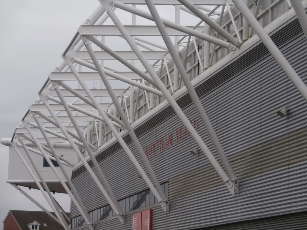
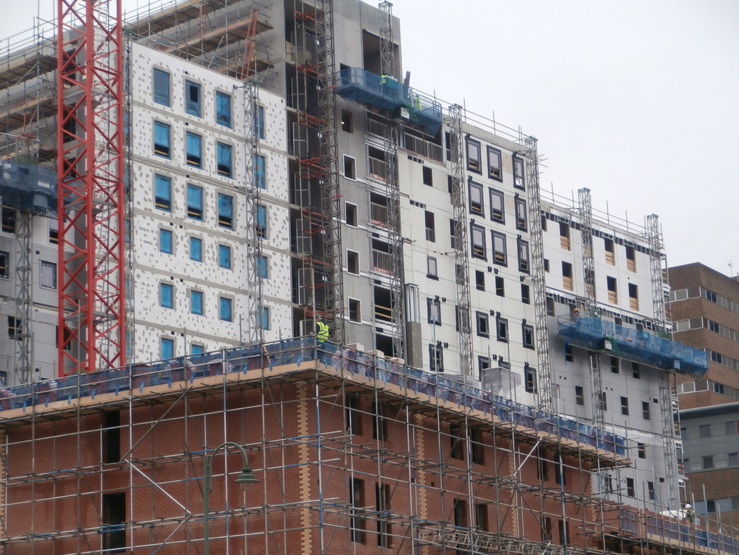
PHOTOSHOOT - Abstract City Centre
Looking up- I took different photos looking up trying to get different shapes and silhouettes that contrasted with the bit of the sky in each photo.
Finding pattern- geometric shapes and patterns, cropping photos and finding unusual viewpoints.
Finding colour- Bright colour that contrast the city.


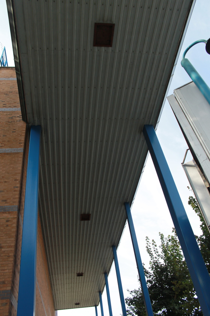
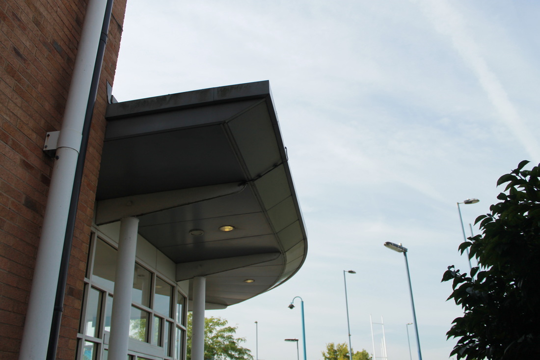


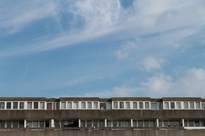
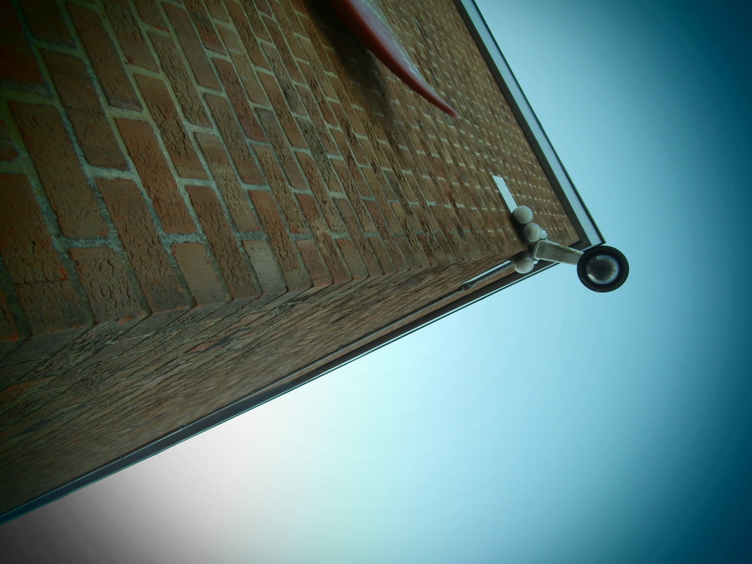
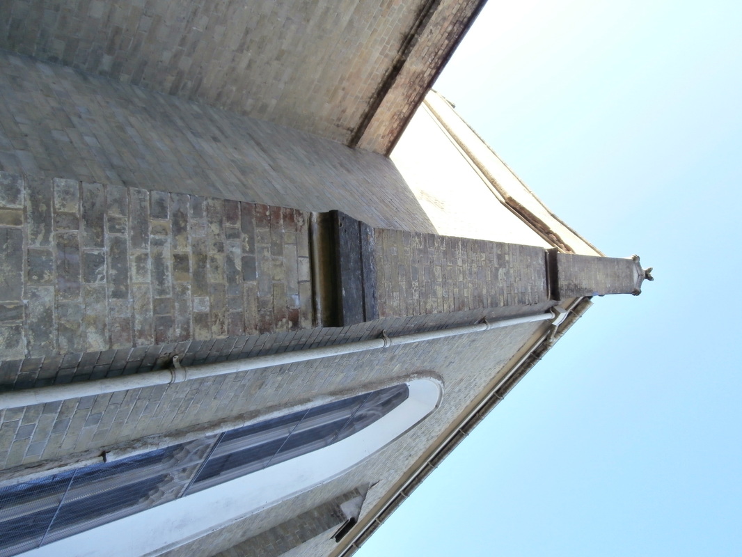
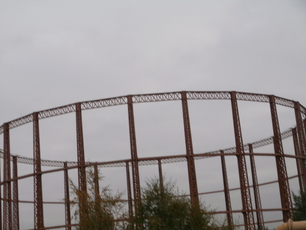
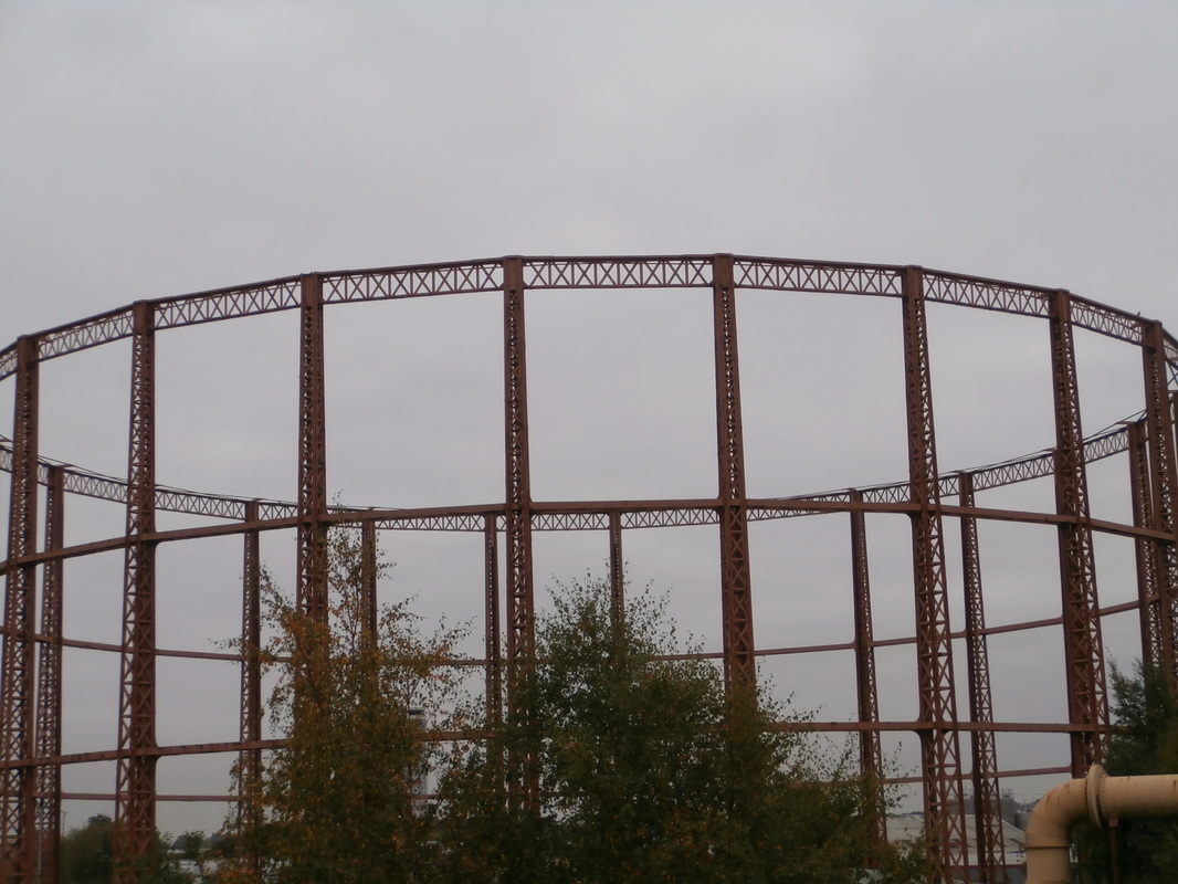
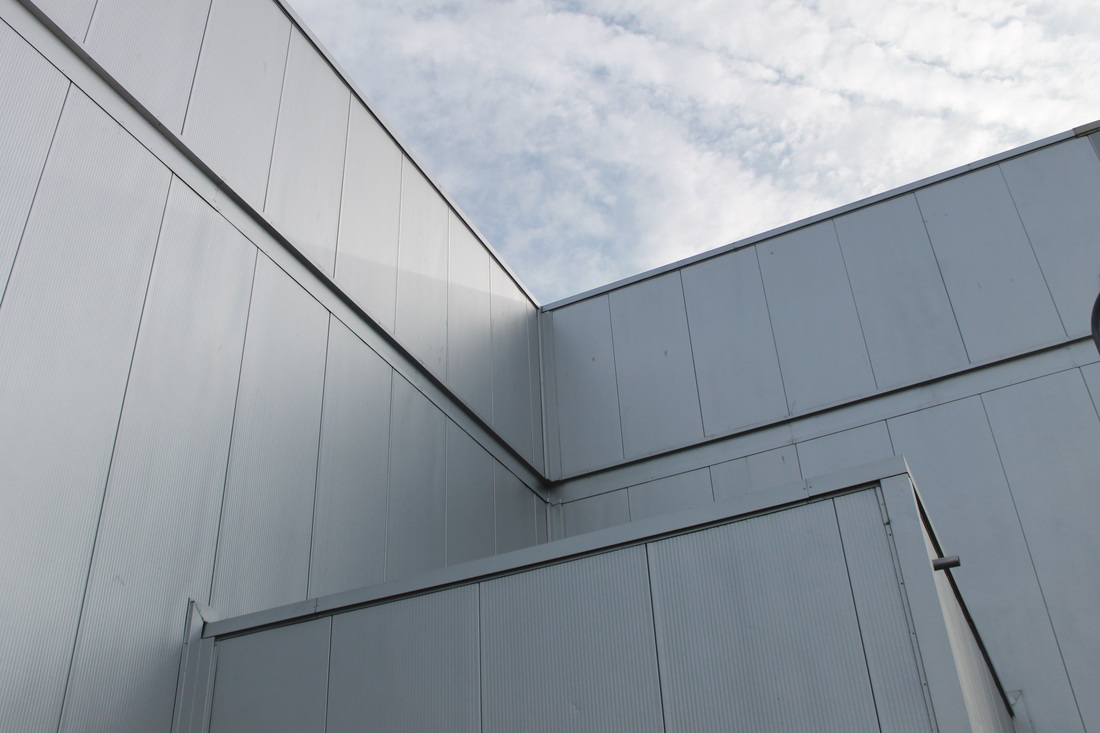
MOHOLY-NAGY
 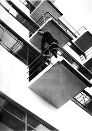 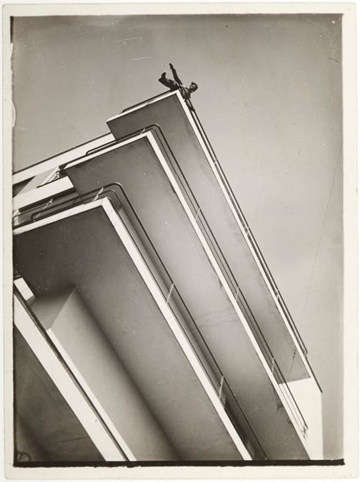 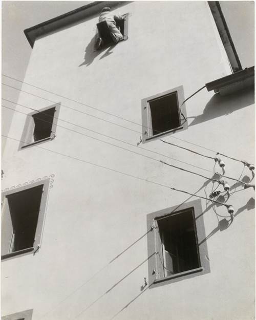  |
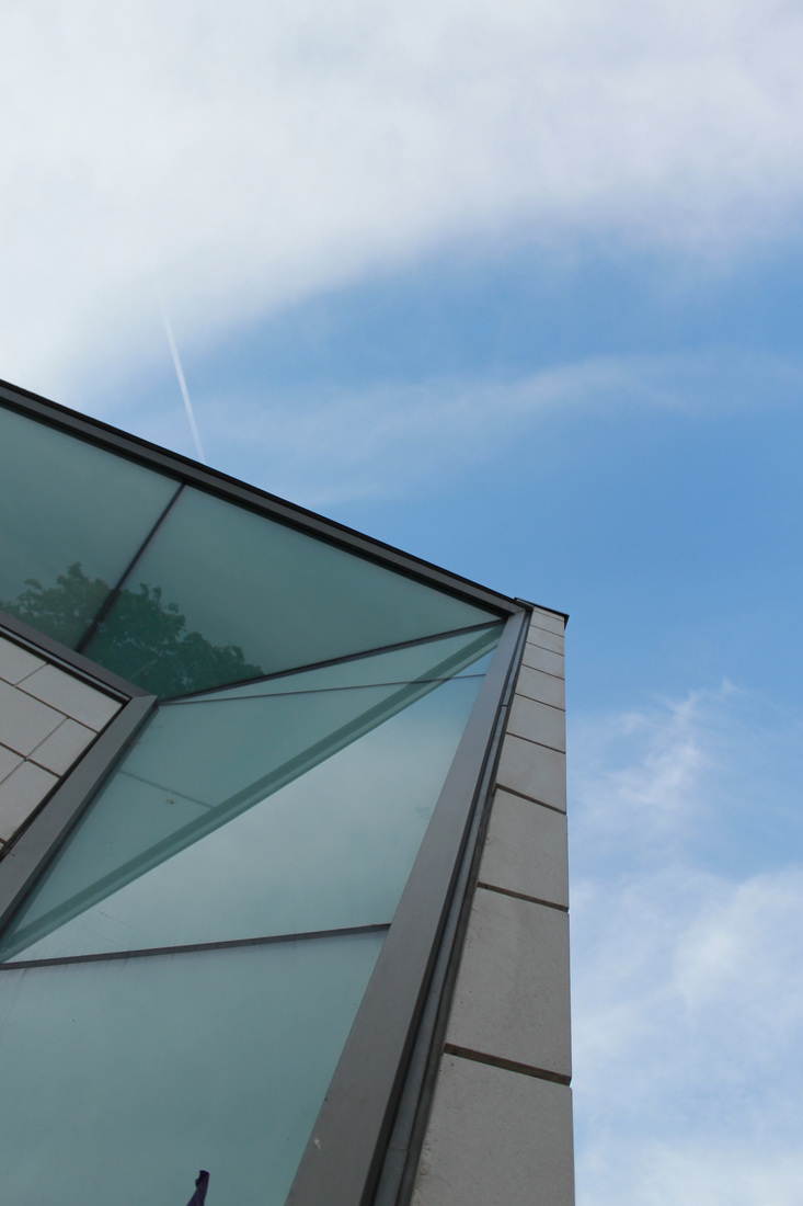
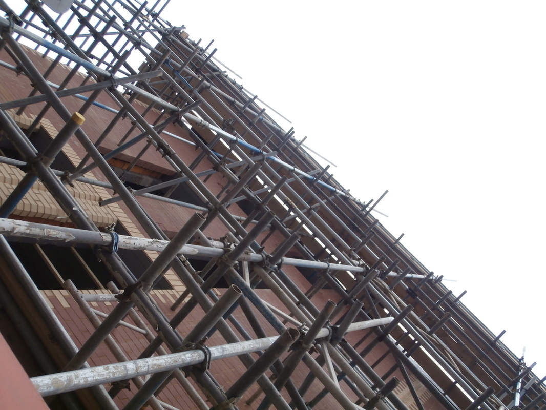
Moholy-Nagy liked photographing buildings close-up from the ground. He chose modern buildings with sharp, clearly defined edges and simple shapes. Sometimes he included a figure to give a sense of scale. When you stand close to a tall structure and look up the perspective is exaggerated. The resulting images can be quite abstract.
|
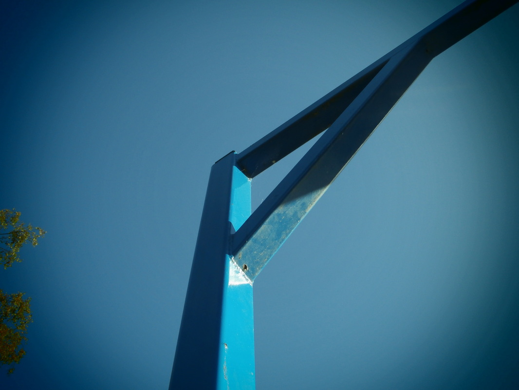
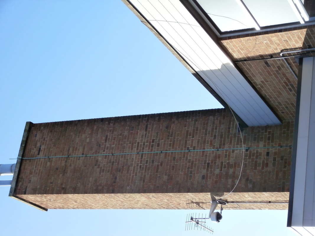
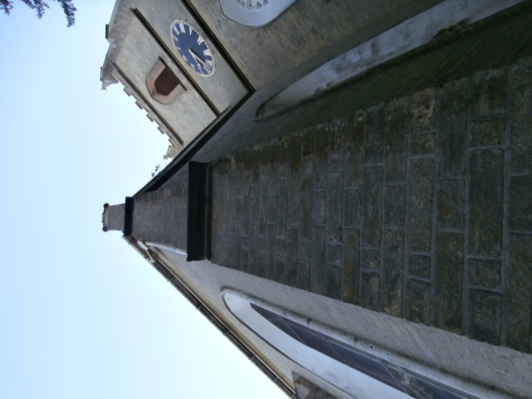
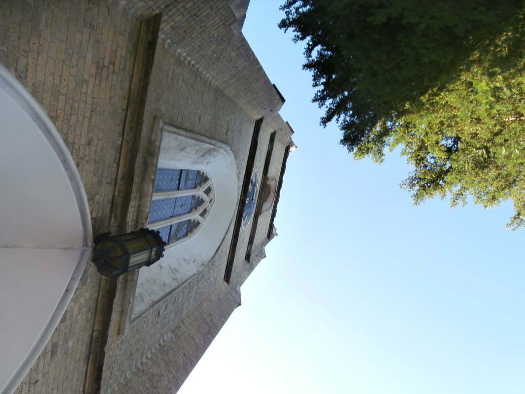
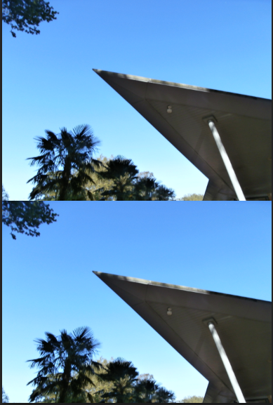
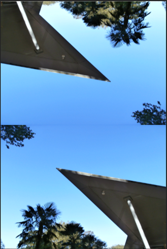
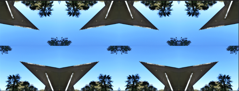
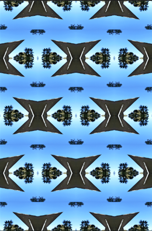
My response to looking up

|
|
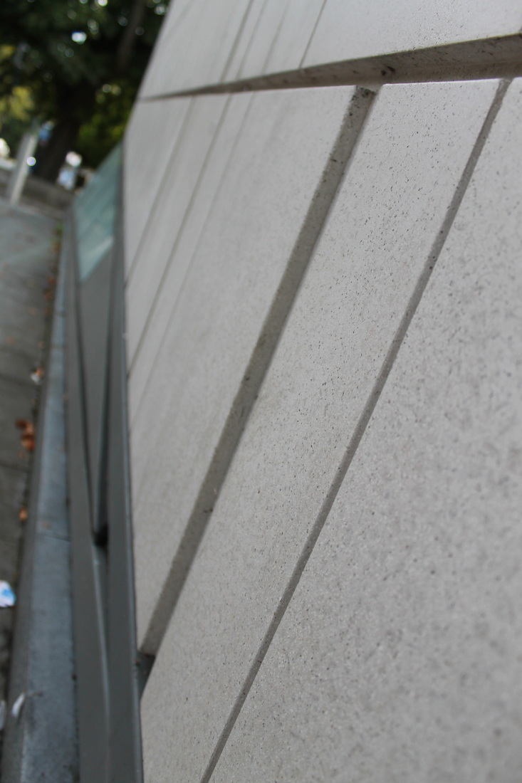
I chose this photo to edit because it has the Sharpe triangular shape into the sky. I used Photoshop to repeat this image, flipping it to create a new pattern. The second photo is my final piece.
|
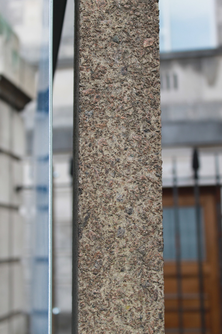
Formal Elements
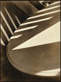
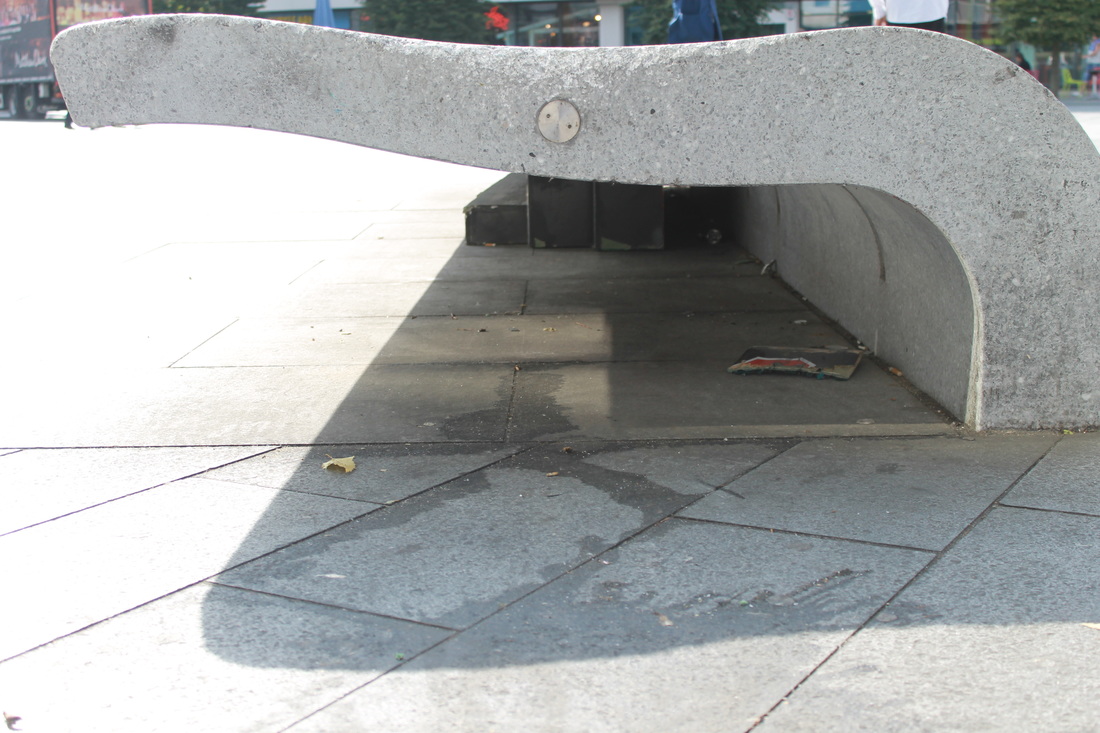
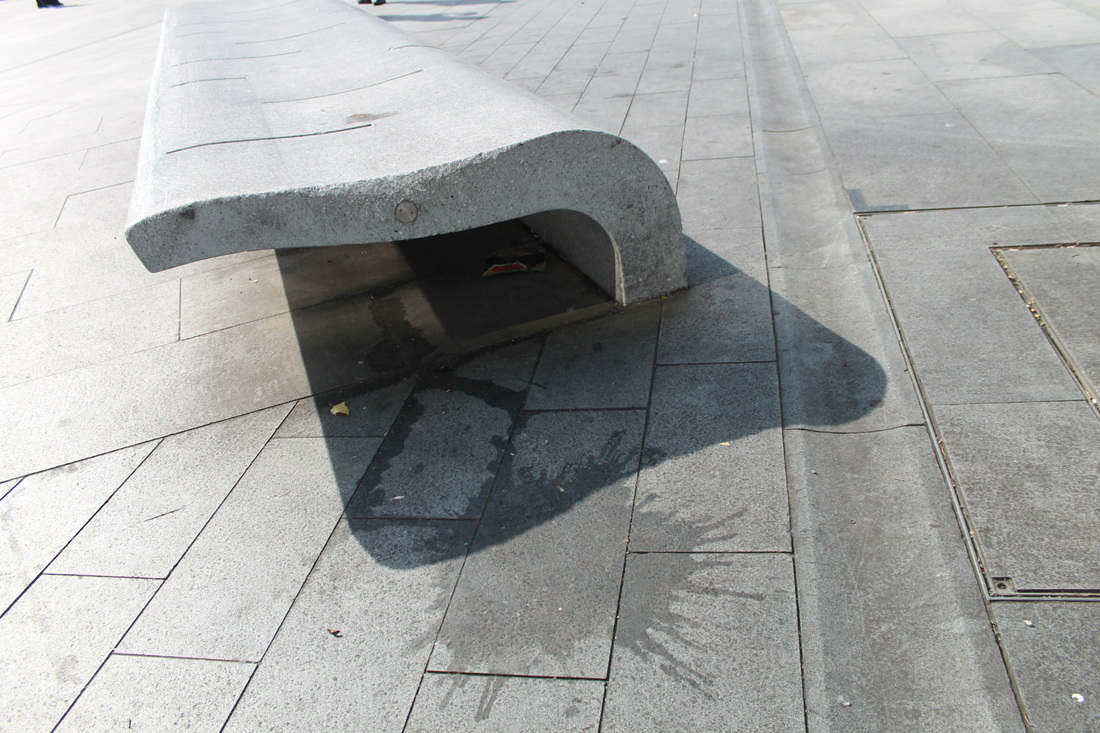
FOCUS: The whole photograph is in focus, the top section of the table seems to be very sharp compared to the bottom right.
LIGHT: There is a contrasting of light and shadows. A triangular strip of sunlight coming across the table, rectangular stripes going horizontal. These were caused by man made objects where the light has hit and gone through.
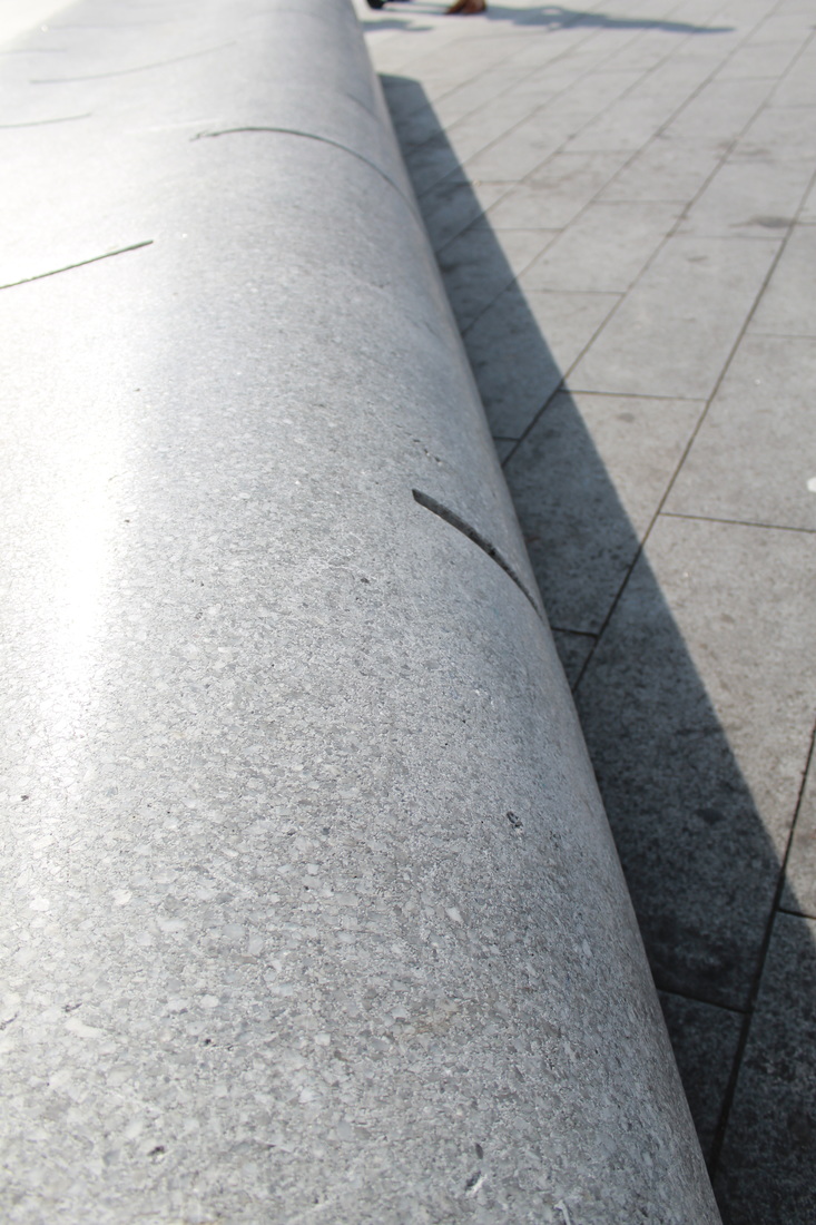
LINES: There is very sharp and rigid lines, however the is a swooping curve from the top right making its way around to the bottom left. this gives this picture a very abstract contrast feel.
REPETITION: Is shown by the sunlight beams horizontally across the table and up the wall vertically. The lines are evenly spaced out and the lines keep going to the end of the top right corner of the picture, this tells us the this repetition could be on going. The repetition gives a dramatic bold effect.
SHAPE: There are geometric and organic shapes, the table taking up most space of the photo has shapes on top caused by the sunlight on top.
SPACE: The bottom left of the photograph there is a depth to the picture I can tell this by the darkness of the shadow contrasting to the table.
TEXTURE: The photo gives an impression that the surface of the table is smooth; I can tell this by the shadows and light reflecting on the object. The wall looks rough and grained, I believe that the walls are made out of wood; I can tell this by the fine lines parallel vertically.
VALUE/TONE: There are a large range of mid tones.
LIGHT: There is a contrasting of light and shadows. A triangular strip of sunlight coming across the table, rectangular stripes going horizontal. These were caused by man made objects where the light has hit and gone through.
LINES: There is very sharp and rigid lines, however the is a swooping curve from the top right making its way around to the bottom left. this gives this picture a very abstract contrast feel.
REPETITION: Is shown by the sunlight beams horizontally across the table and up the wall vertically. The lines are evenly spaced out and the lines keep going to the end of the top right corner of the picture, this tells us the this repetition could be on going. The repetition gives a dramatic bold effect.
SHAPE: There are geometric and organic shapes, the table taking up most space of the photo has shapes on top caused by the sunlight on top.
SPACE: The bottom left of the photograph there is a depth to the picture I can tell this by the darkness of the shadow contrasting to the table.
TEXTURE: The photo gives an impression that the surface of the table is smooth; I can tell this by the shadows and light reflecting on the object. The wall looks rough and grained, I believe that the walls are made out of wood; I can tell this by the fine lines parallel vertically.
VALUE/TONE: There are a large range of mid tones.
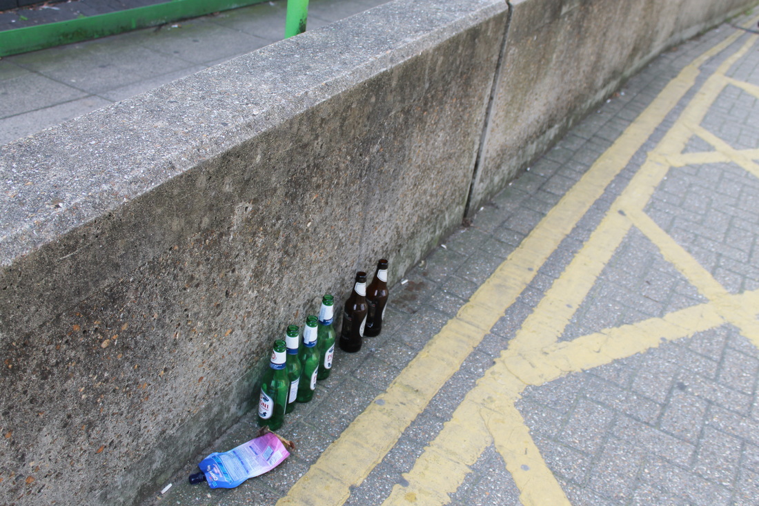
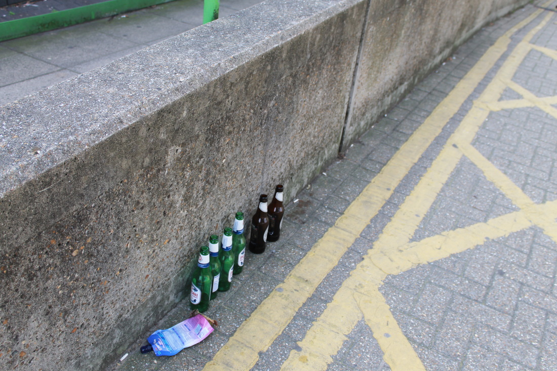
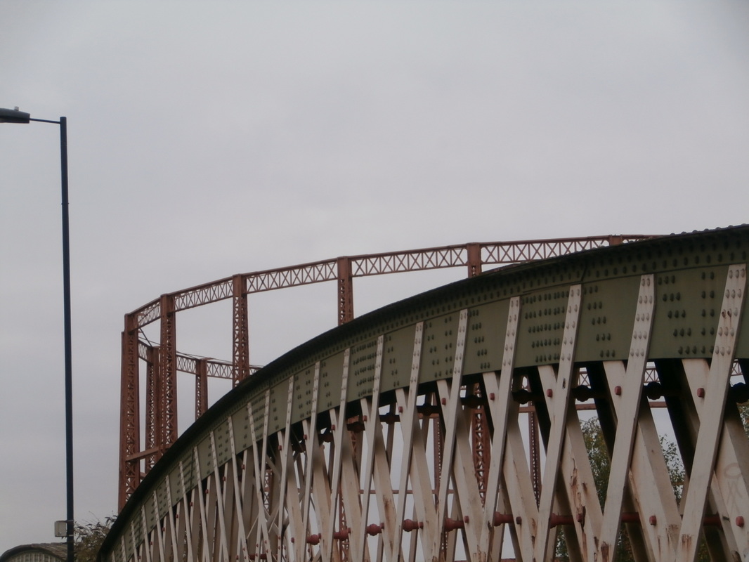
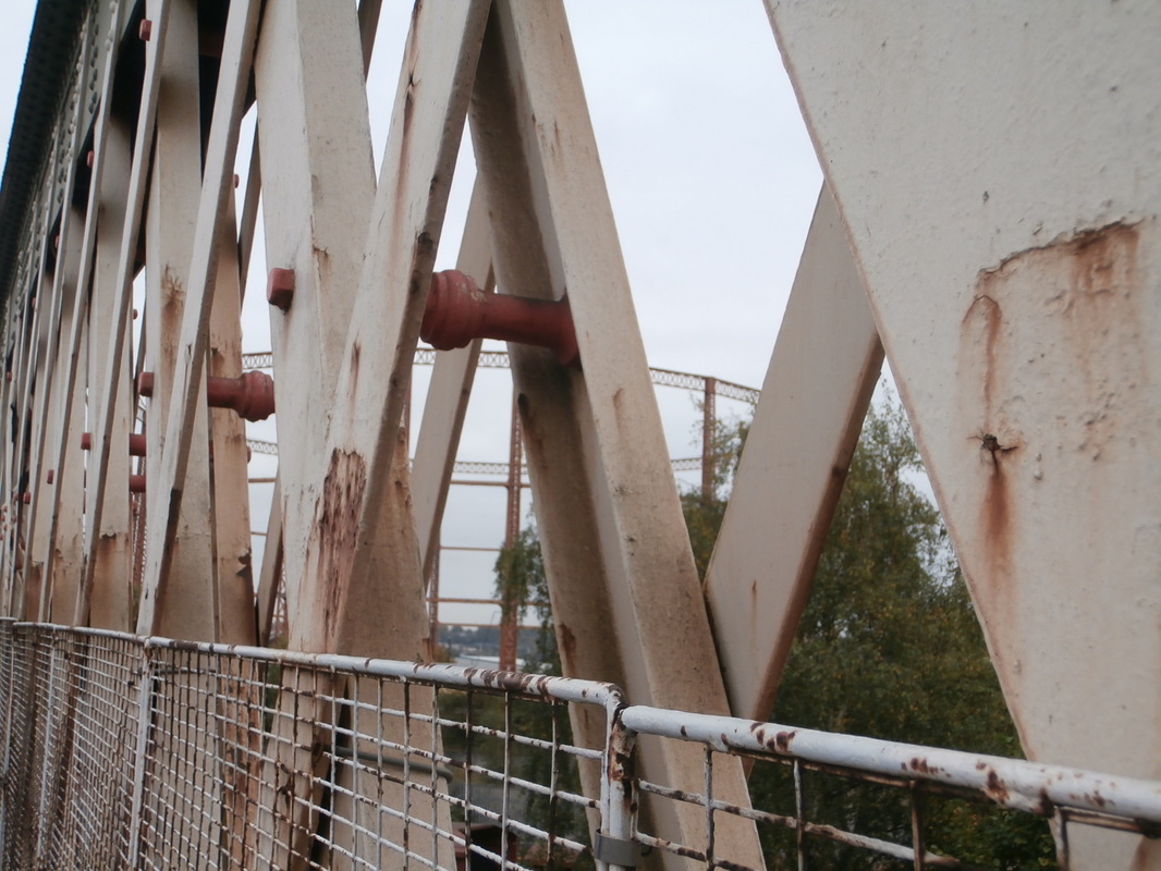
Keld Helmer Peterson
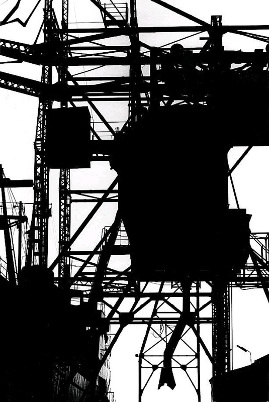 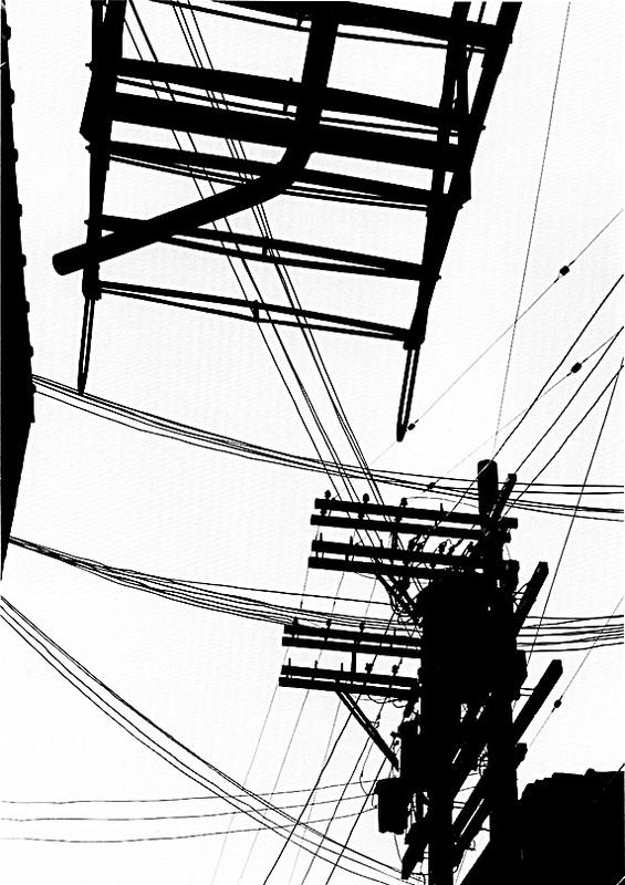 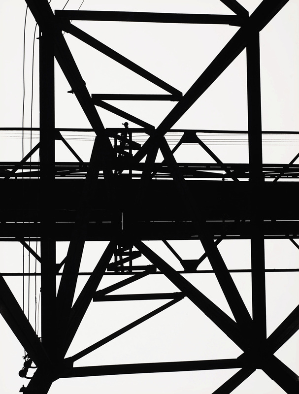  |
The silhouettes that are created by these highly contrasted photographs show the stark industrial nature of the urban environment. Peterson focused on the composition with lines and shapes overlapping to make the bold photographs.
I am inspired by this approach and will use the elements of line and contrast to investigate my urban environment. |
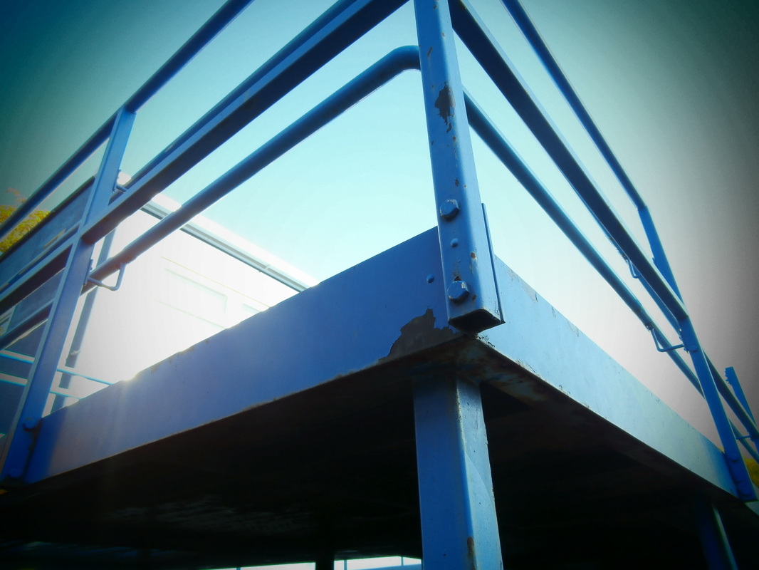
This was my unedited photo.
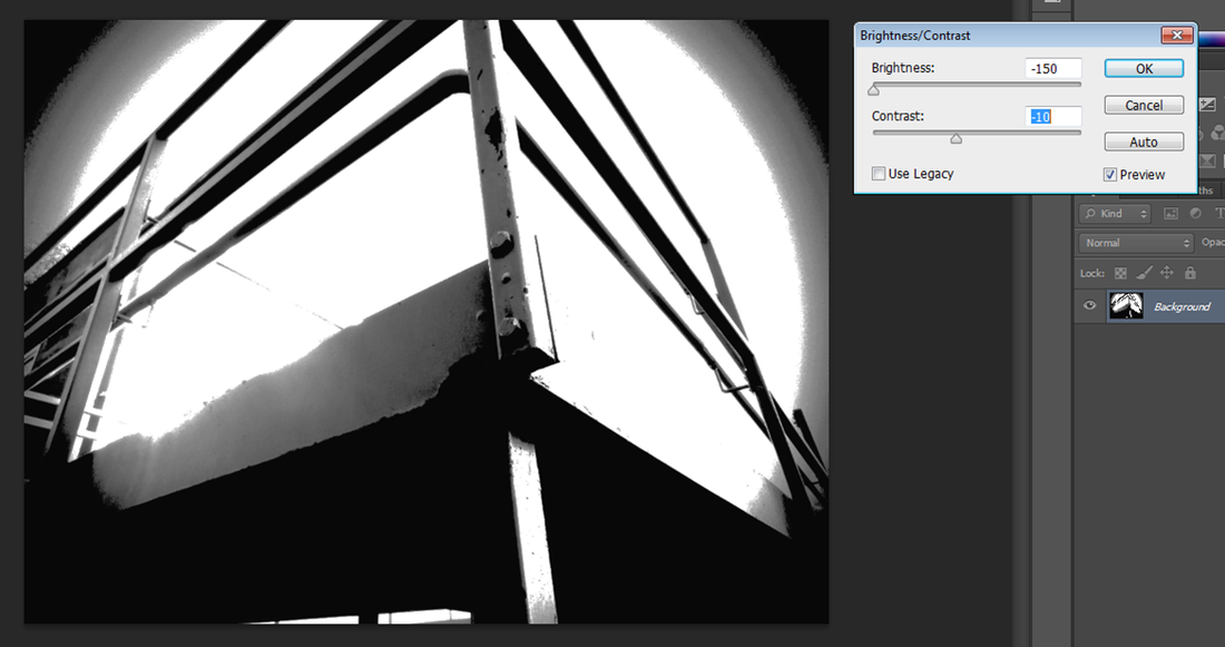
I then changed the brightness and contrast.
|
I put changed it to grey scale.
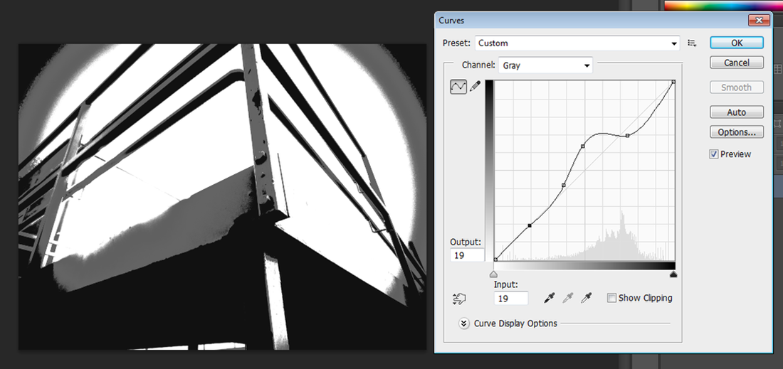
and finally I changed the curves.
|
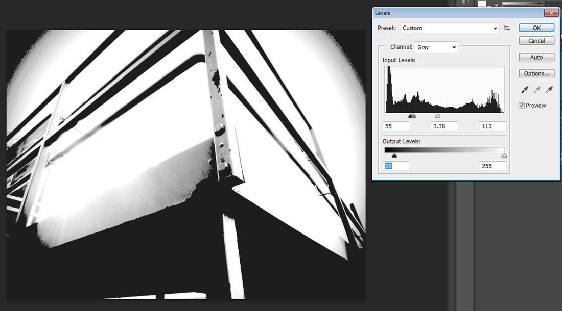
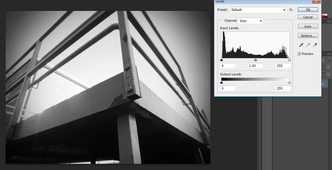
I then changed the levels.
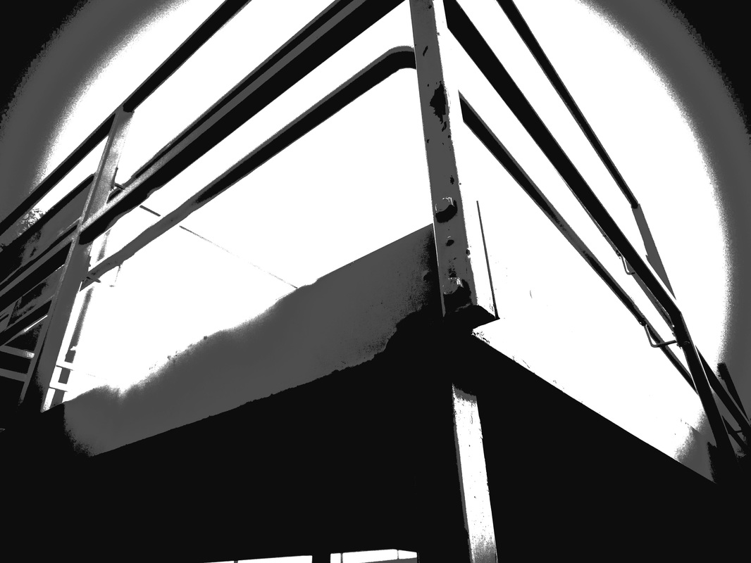
This was my final edited piece
|
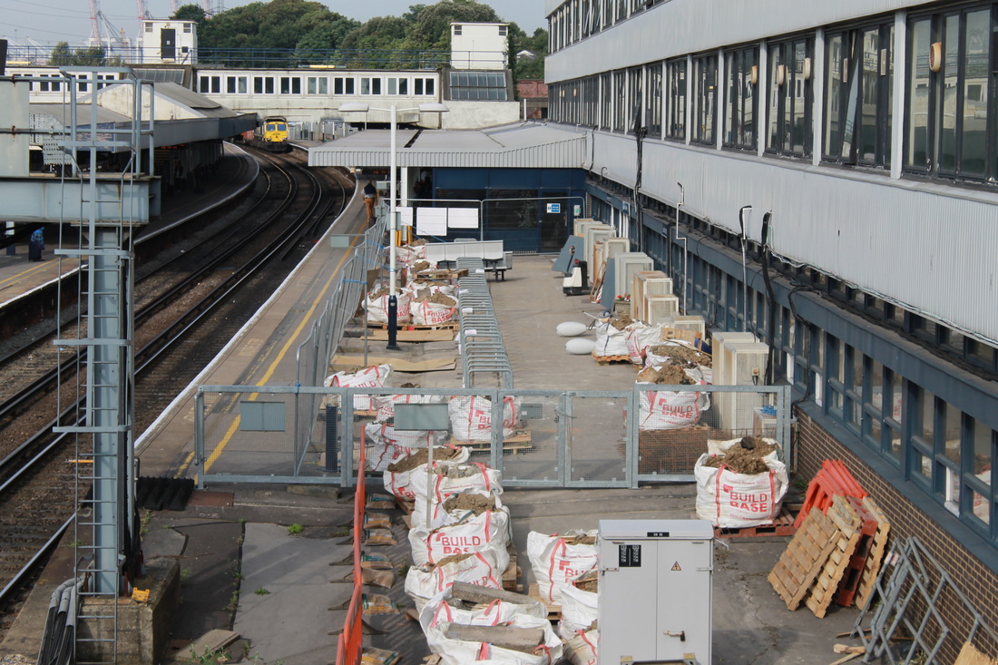
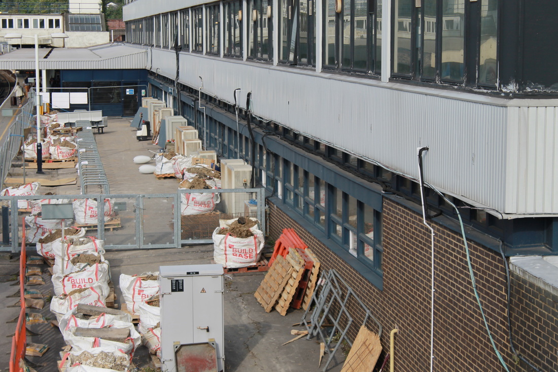
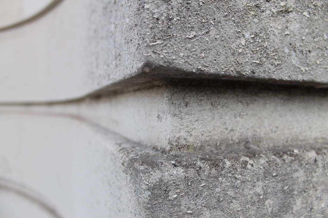
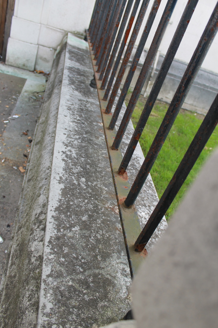
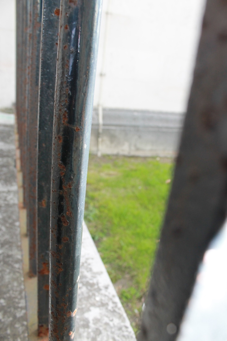
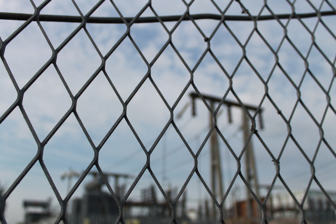
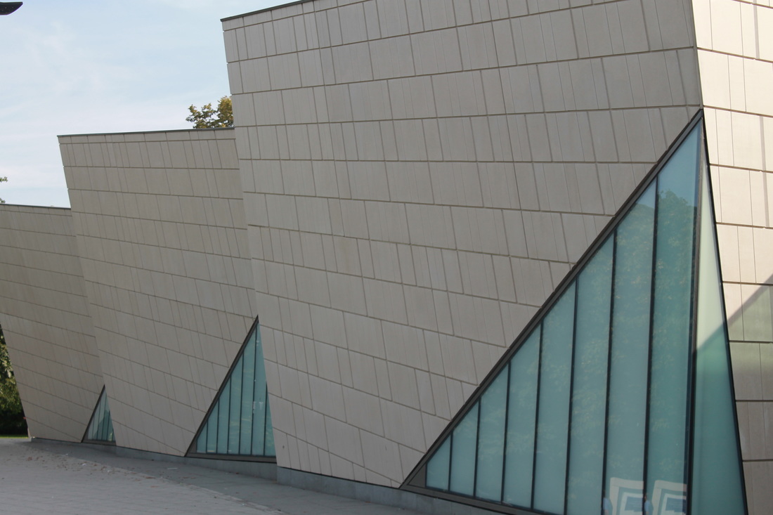
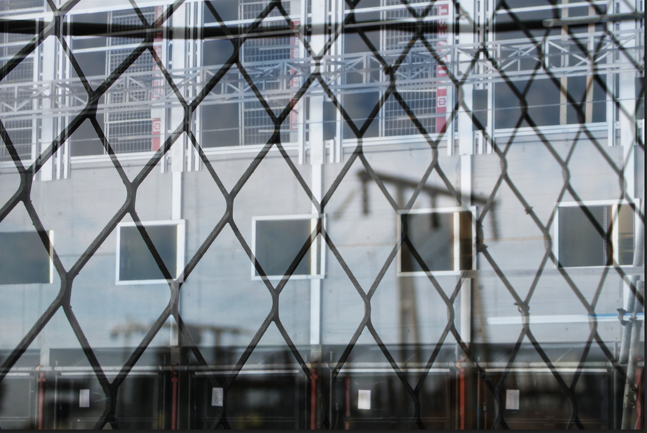
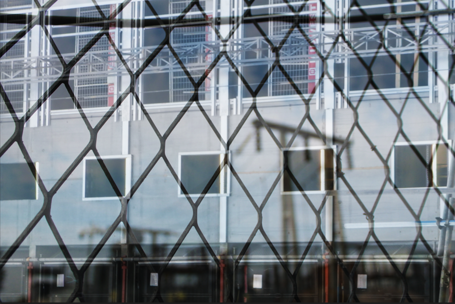
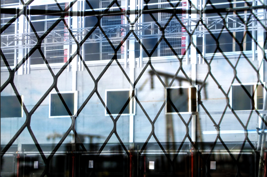
PHOTOSHOOT - Pattern, shapes and repetition


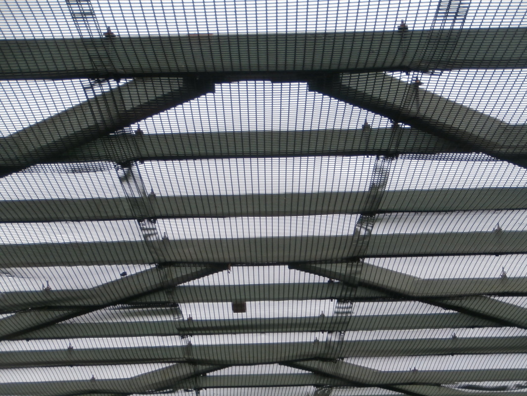
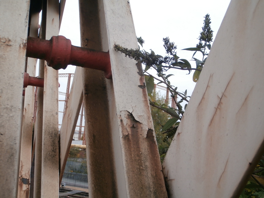
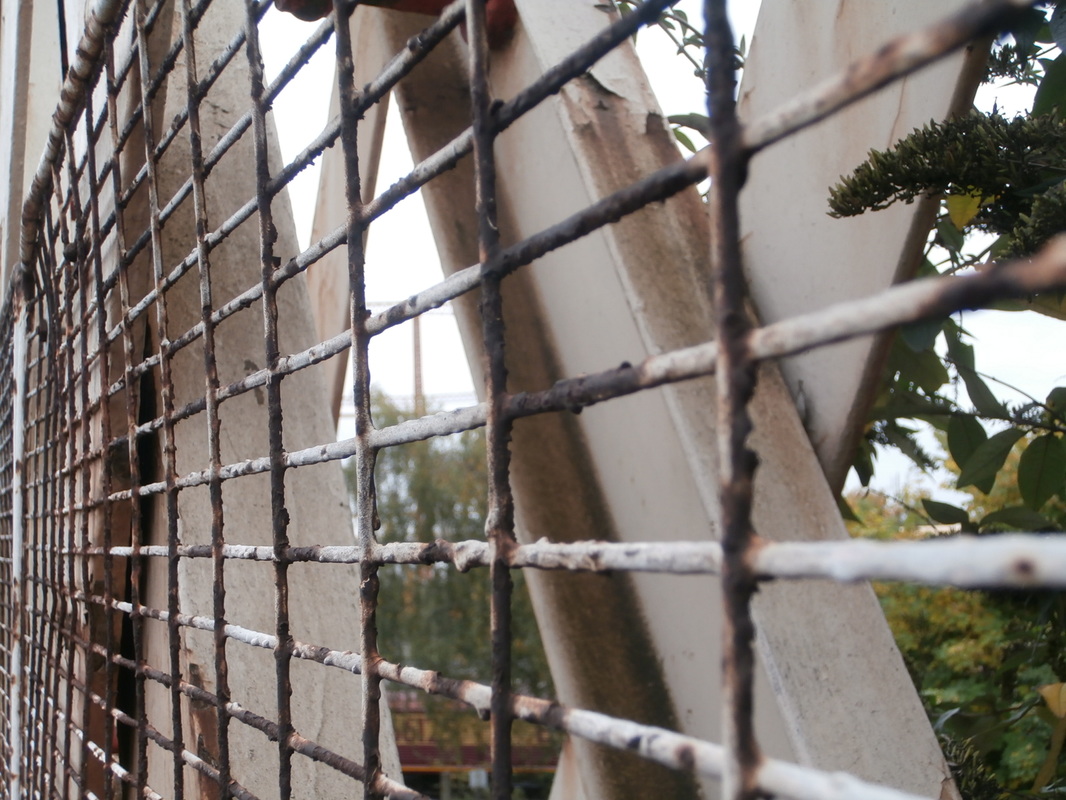
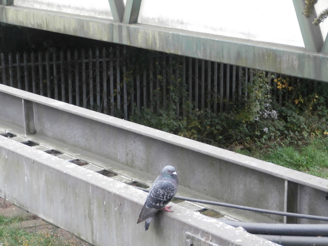
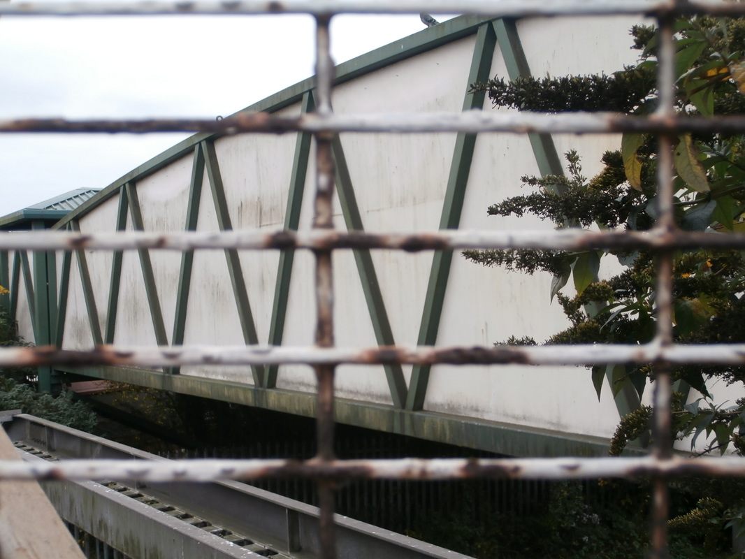
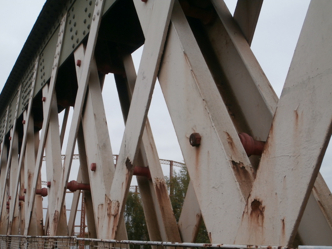


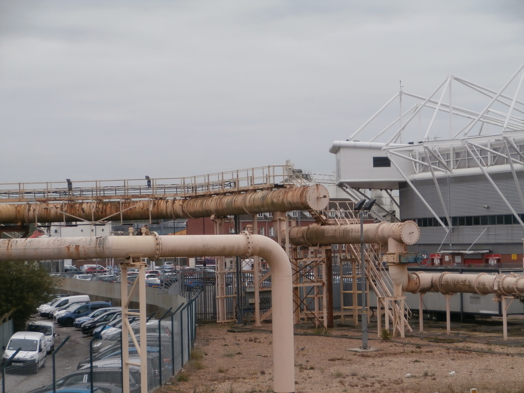


Most successful photographs.


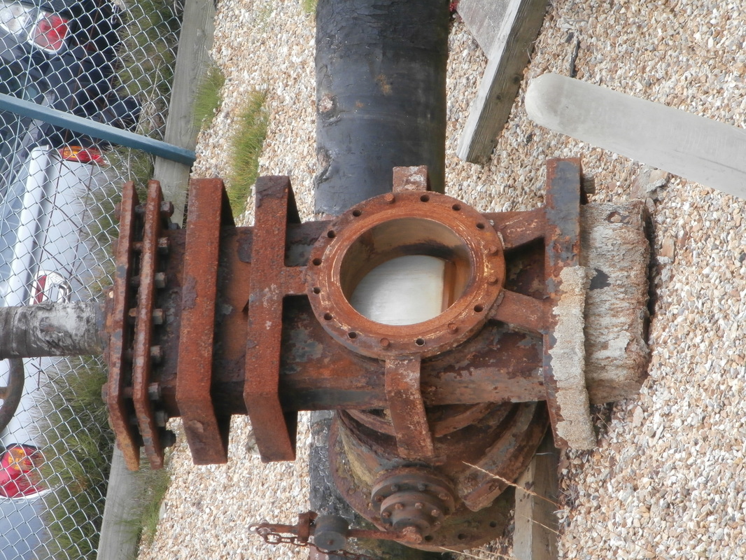
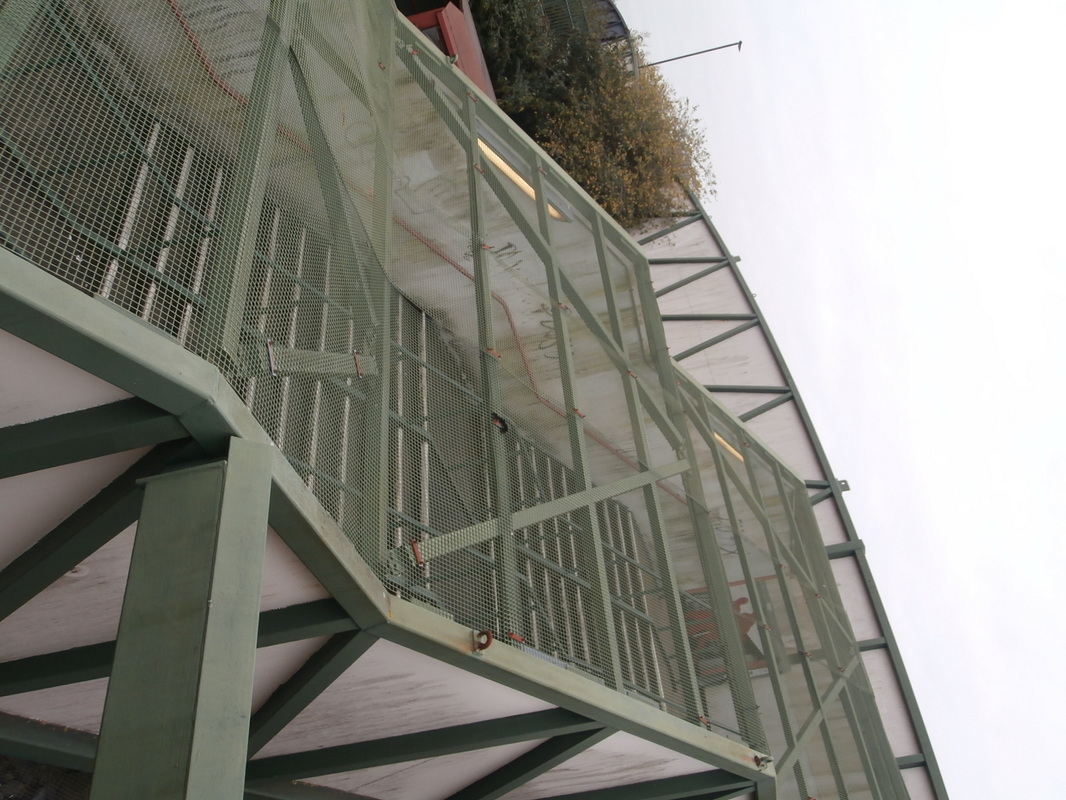

By selecting these photographs I am starting to see the links between them.
|

|
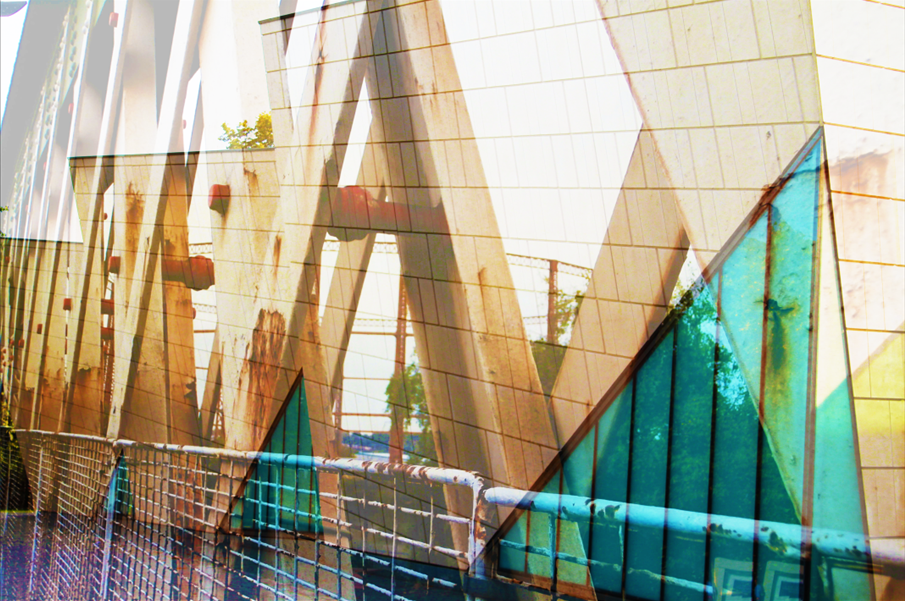
I selected these two photos to develop and become an individual photo.

I started with this photo as my back ground I then added the next photo on top.
|
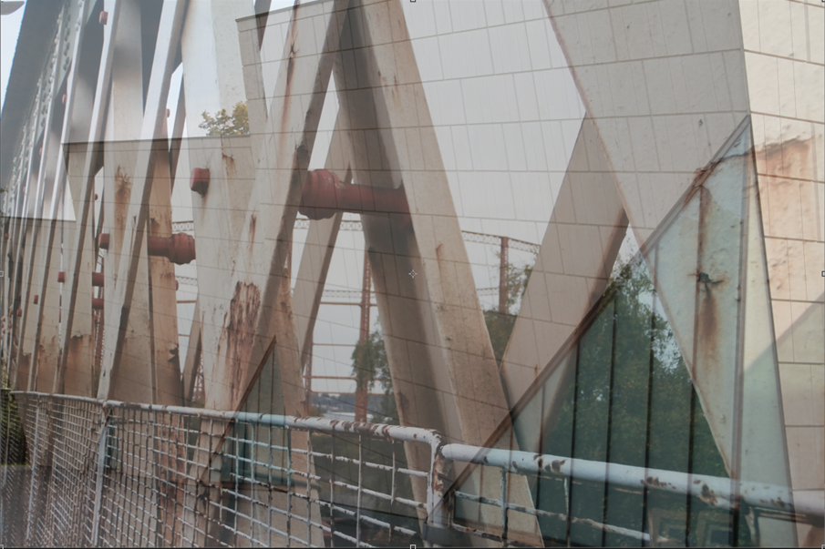
I opaque the top layer so that the background was able to be seen.
|
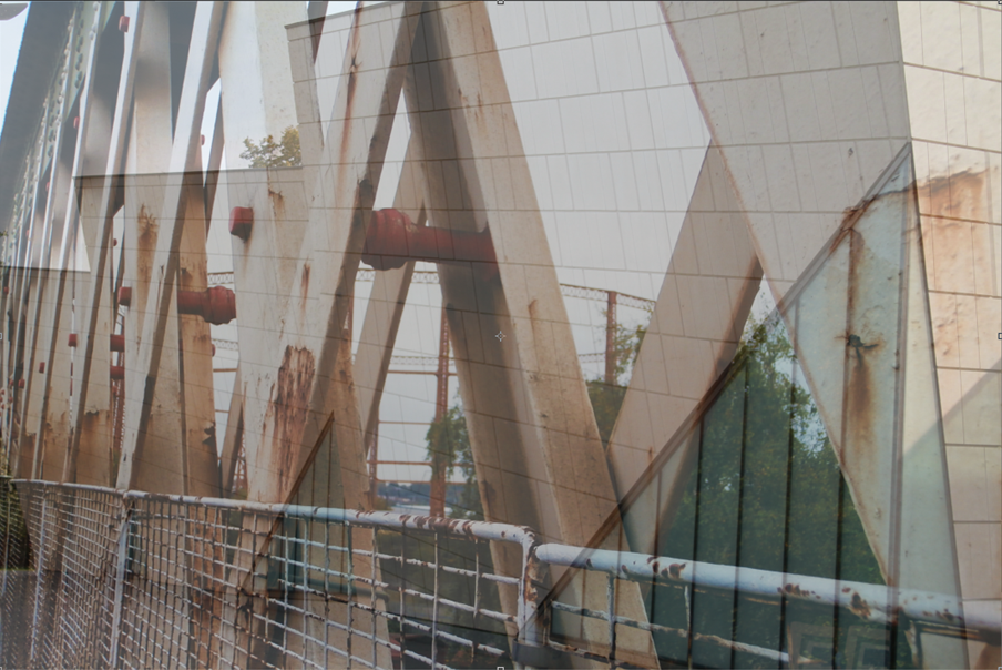
I edited the contrast and exposure.
|
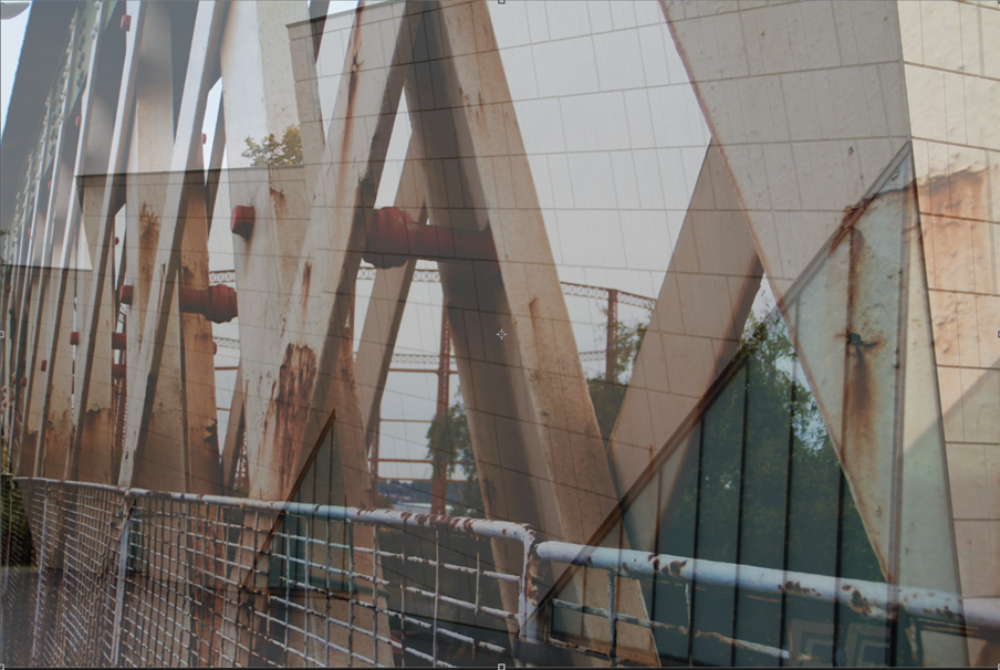
I then changed the vibrancy.
|
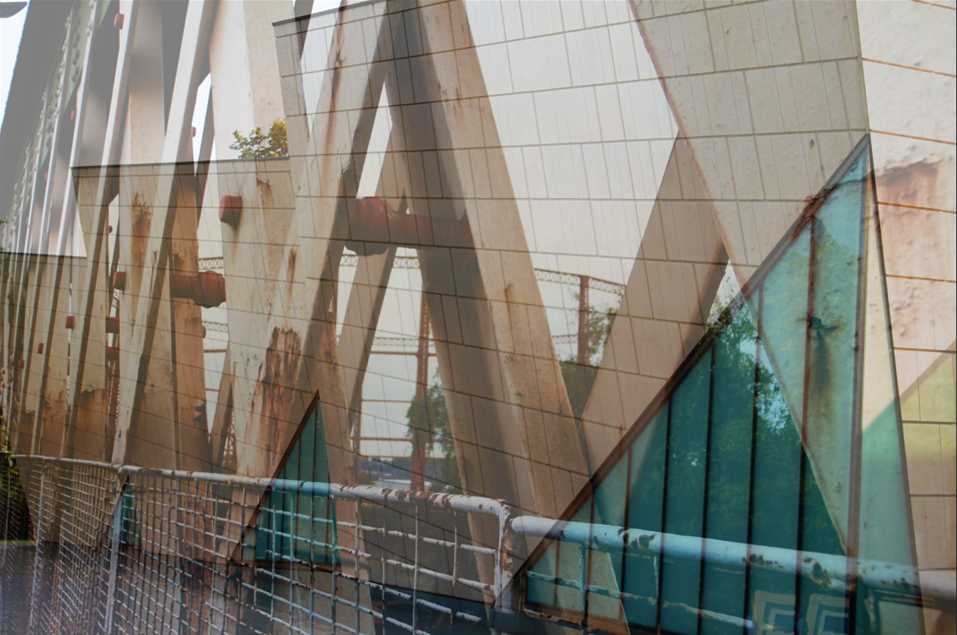
Then I edited the background the same as the layer 1. Finally, flattened the layers
|

|
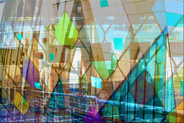
This was my final piece. I like how the vibrancy enables to see the colour of the glass and it contrasts to the other photo. It also, made the lines stand out more, as you are able to see the diagonal lines from the glass but also the iron bridge. I would however, flatten the layers at the start as this made it work editing both layers.
|


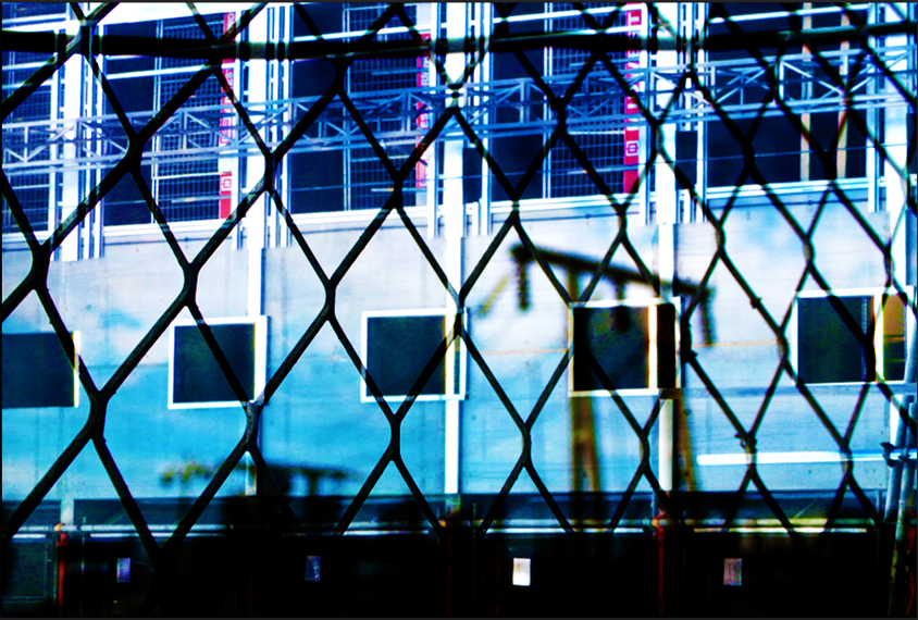
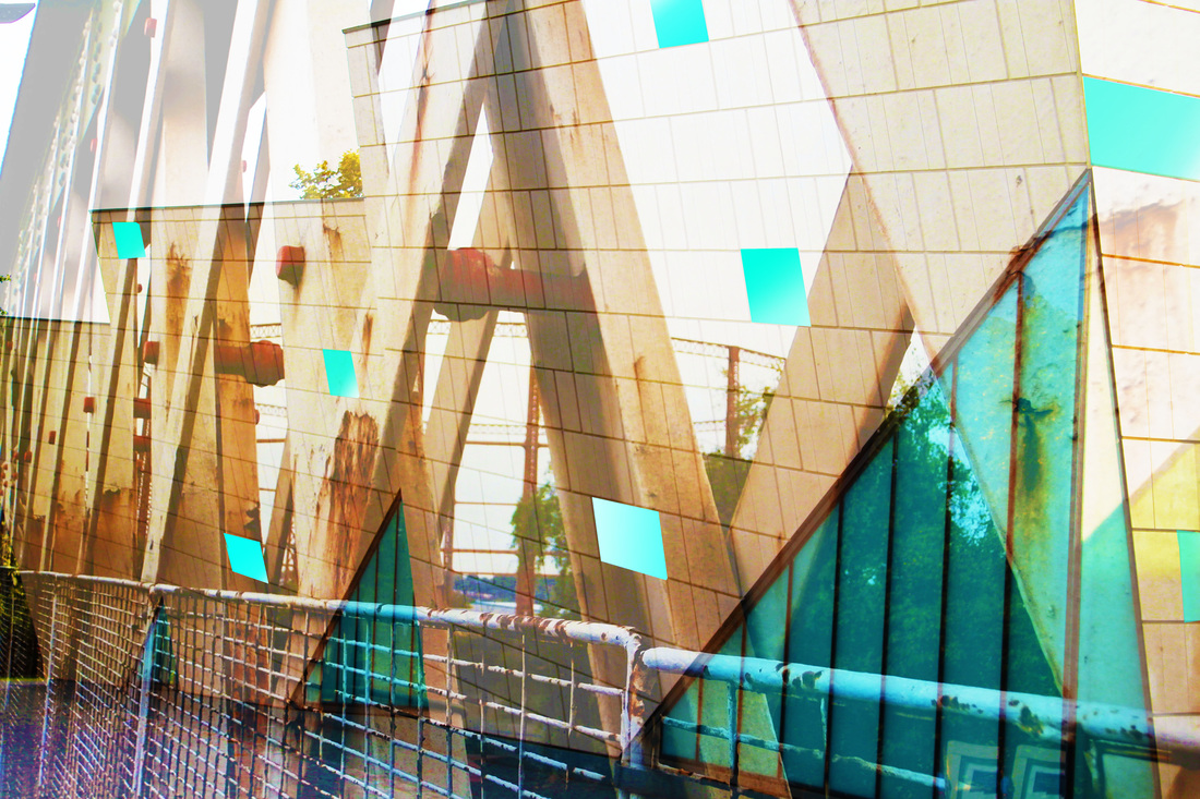
These are the two photos I used.
|
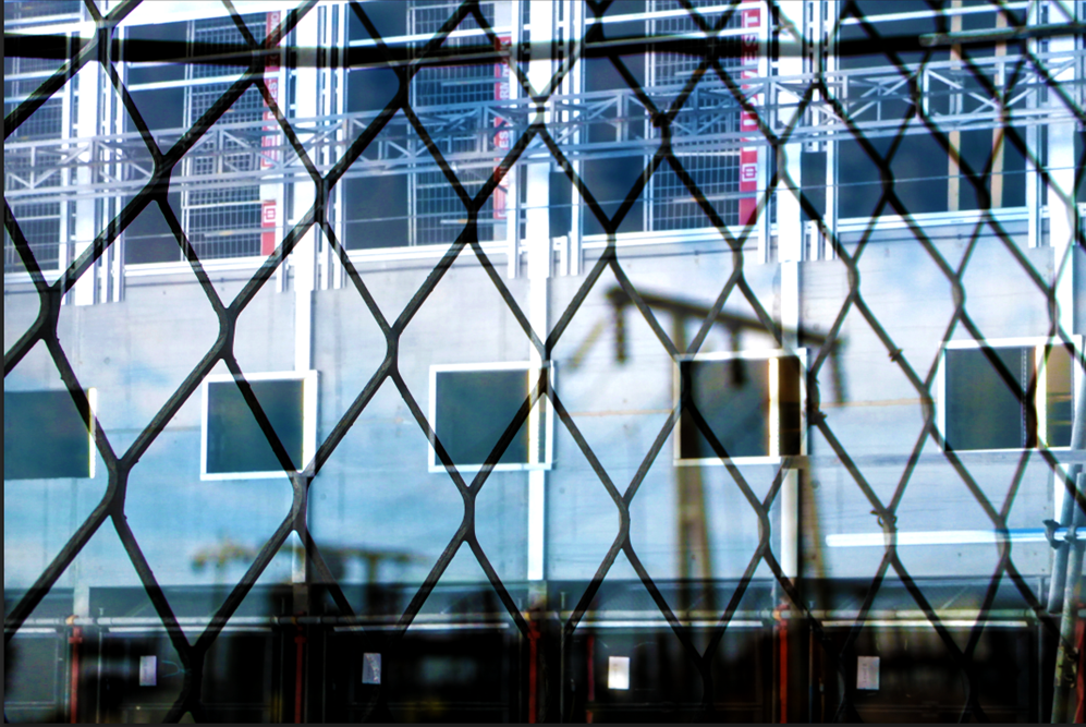
This is my final piece; I love the colour and how the fence fits in with the second photo.
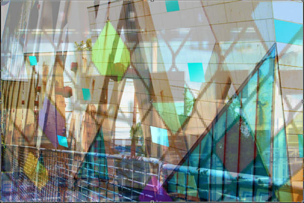
Learning from my mistake as soon as I combined the two photos I flattened them. In the top left photo I have changed the contrast, the top right the exposure. Bottom left levels and finally, bottom right I changed the vibrancy.
|


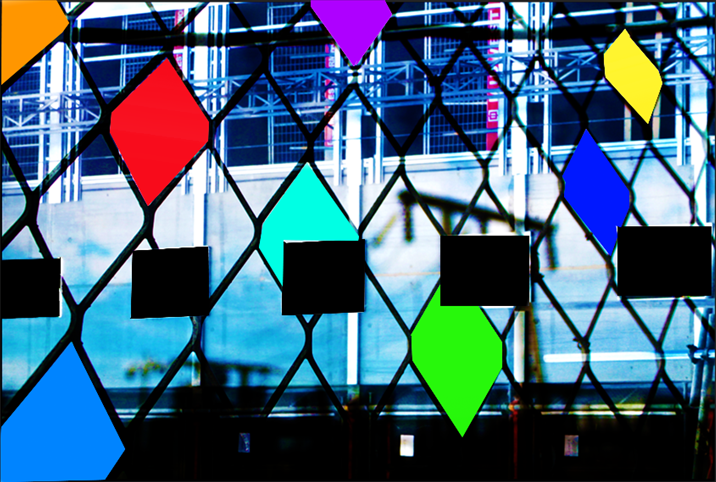
With my two final pieces I decided to make them look similar to be able to see the similarities. So I changed the vibrancy and the curves to make them bold and sharp.
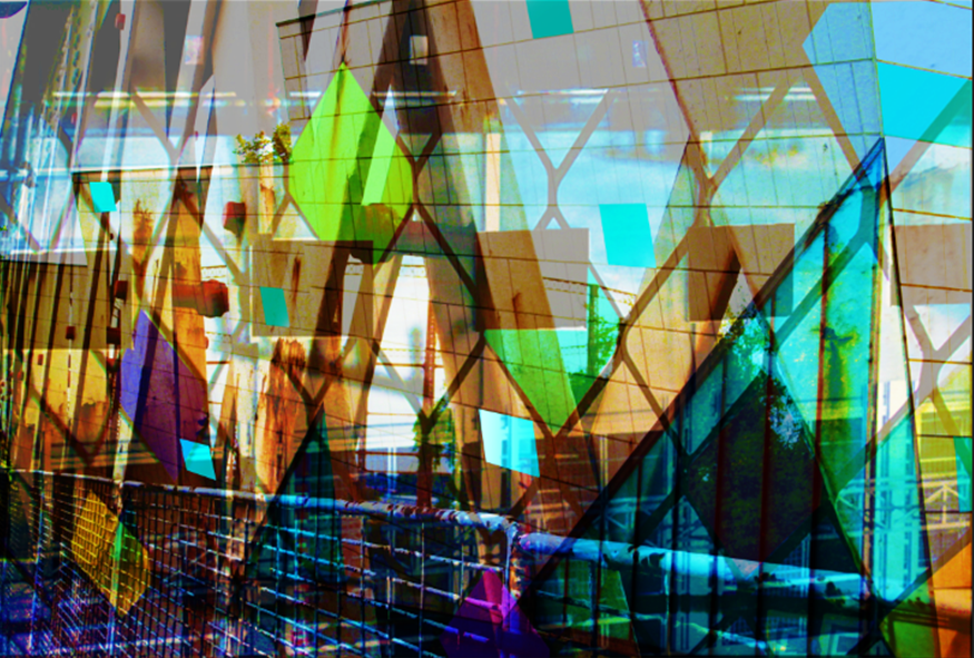
DEVELOPING MY PIECE
At first I rotated the second picture 180 degrees. I then opaque the top layer. I then flattened it. At this point this picture looked very messy and unpleasing to the eye.
|
I then decided to turn the vibrancy up so that the colours could pop out. I was still not pleased as it wasn't eye catching however I new that I wanted it to be sharper and deeper.
|

I changed the curves. This was very successful as all the colours popped, making it look bold and sharp. I was pleased as it is now eye catching.
|
|
As my final piece `I like how all the contrasting colours
|
